Oct 01

Small things; How Facebook and Twitter share new features

Tech with tags: , , 5 Comments »

This is incredibly anal, but I appreciated it. When Facebook launched their new look and feel, it started out on a beta site, and then migrated to become the default. For what feels like a looooong time, I have seen this header:

Facebook New

The problem is that I get it. I know now. Let me get rid of the header please!

Twitter on the other hand did a really good job with this. When they launched the election subsite I started to see this:

Twitter Election Header

Once I internalized that I could click on the ” X ” close icon and it would minimize to this:

Twitter Election Minimized

Minimized allows me to get back to it if I want, but without taking much real estate. There have been some issues where it doesn’t seem to remember that setting, but in general I like this kind of implementation. On the right hand side they have a little box for their new look and feel that says “Notice something different? Read about the changes.” I wish that had an ” X ” too, without minimize, as again… I know it is new, and I don’t need to read about it anymore :)

Sep 29

Small feature, huge difference; Correlating entries in FriendFeed

Tech with tags: , No Comments »

A week or so ago, FriendFeed included a feature that changes the experience for me on the site.

I used to see this kind of stuff all the time:

FriendFeed Duplicate

Many people would Twitter something with a link, and post it to del.icio.us, and blog about it, and also were members of FriendFeed Rooms. This is a poisonous interface, as it gets very frustrating for the user (at least, for me).

With the new feature, my flow looks like this:

FriendFeed Related

It appears to be quite smart too. It puts together items, kind of like TechMeme, where you see Bob posting to his blog, and then Harry posting about it too appears under that item. It is doing smart grouping, which in turns give you more content.

I would like to see it go further in some ways, and not take up as much space on the “related” line, especially for items that are true duplicates. The algorithm is still getting its grove on, and I often still see the duplicates, but this is a great feature, and knocks down another mini-barrier of my FF usage.

Sep 25

Frustrating User Experiences: iPhone NetNewsWire and Newsgator

Tech with tags: , , 7 Comments »

iPhone NetNewsWire

I love NetNewsWire. I still prefer it on the Mac, and was jazzed to get it on the iPhone. Unfortunately, the picture above is normally about as far as I get with the iPhone NetNewsWire application.

I am sure that the problem is that I have many feeds. Too many for the application to handle. I wanted to give it a hand, and setup a profile of only the feeds that I really care about. I have folders already setup on my desktop application for this. I have the ‘must read’ folder, and then other ancillary ones.

Newsgator has thought about this, and gives you the ability to setup different profiles for various devices and systems, but the UI is awful, and misses the key feature that I need. As you can see below, when you have a profile, you can’t just select an entire folder, but instead you get a list of feeds! This means that I would have to go through all of my feeds and manually select the ones from my ‘must read’ list! And, what about when you add a new feed? You have to go in and select it for that profile then too? Ugh, do I really have to migrate everything to Google Reader?

iPhone Newsgator

Aug 29

Frustrating User Experiences: Techmeme Meta Refresh

Tech with tags: , , 4 Comments »

Refreshing Grapes

If you have a site or application where content updates regularly, it can be nice to update the content for the user. Techmeme falls under that category, and they have at the top of their page:

<META HTTP-EQUIV="Refresh" CONTENT="1800">

The problem is that every now and then I come back to the browser and I see:

TechMeme

The refresh seems to be happening when network connectivity isn’t there and thus you get hit and the page dies. This isn’t a huge pain, you can manually refresh, but for some reason it bugs me a little.

What can you do? An ugly, error prone technique would be to test a connection before doing a refresh:

function pingRefresh() {
  var location = window.location;
  var xhr = new XMLHttpRequest();
  xhr.open('HEAD', location);
  xhr.onreadystatechange = function() {
    if (this.readyState == 4 && (this.status == 0 || (this.status >= 200 && this.status < 300))) {
        window.location.reload();       
    }
  }
  xhr.send(null);
}
 
setTimeout(pingRefresh, 60000);

Or, it may make sense to be able to update part of the page (the main div or what have you) instead of asking the entire page to refresh. FriendFeed seems to do this and has:

var gFeedSpecs = {};
var gFeedAutoRefresh = [];
gFeedSpecs['feed1'] = {"start":0,"num":30,"type":2,"hash":"f003fa699d7e64b96f2b901922d13ed8"};
gFeedAutoRefresh.push('feed1');
$(function() { if (gFeedAutoRefresh) { autoRefresher.start(120000); maybeRestoreHtml() } });

Other Frustrating User Experiences

Aug 28

Frustrating User Experiences: Tough Captchas

Tech with tags: No Comments »

Tough Captcha

Captchas are annoying. Half of the implementations that have you type in something from the image are unreadable for my eyes. I am sorry that I have to use them on my own blog. This one though, makes it very tough.

I had this on my own MT blog back in the day, when the code that would generate the images failed leaving the user with no option at all, other than to stop participating. Die captchas, die!

I still find that my own CommentQ plugin that lets me customize questions works fairly well. Because even Ajaxian is “niche” no one has an automatic attack. The odd ones that get through are the farms where captchas are shown to real people who solve them. I still remember the time where I had a spam comment get through, and then a real comment right after from the exact same IP, name, etc…. the spam farmer answered a real post! :)

Other Frustrating User Experiences

Aug 20

Frustrating User Experiences: iPhone Mail.app

Tech, iPhone with tags: 14 Comments »

One of the most common tasks that I have as I check email on my phone, is jumping between work and personal email. This breaks down for me on the iPhone due to the menu system.

When you are on one inbox:

iPhone Inbox

you then have to go back, through the list of folders, to the accounts screen:

iPhone Accounts

At this point you then have to go back into the other account. This makes 4 animated clicks to go from Inbox to Inbox, and even more if you are already in a message.

Since this is so common for me, I would like to be able to bypass the menus and have something like a dropdown to go directly from Inbox to Inbox. Here is an incredibly crude visualization:

iPhone Dropdown

Maybe a nice gesture… a swish… which sends you back and forth :)

Other Frustrating User Experiences

Aug 19

Frustrating User Experiences: Wordpress Categories

Tech with tags: , 5 Comments »

I use Wordpress a lot, and love the product. But, when you are working with something every day, you see its quirks too, such as the Wordpress Media Upload.

This time though, I have to mention the categories system. In the latest and greatest 2.6.x branch, the admin console got rev’d quite a bit again, and the categories system now has this:

Wordpress Categories

There is some good thinking in here, such as having the “popular categories” filter, but having a huge list of check boxes in a very small area is painful indeed. Scrolling through the list to find the categories that you want it ugly.

The older version actually suited me quite a bit better:

Wordpress Categories Old

At least here you had the input text box on the top, so you could type in the items, and then you would see them selected and thrown at the top just to let you know. This was much better. The problem was the fact that a Google Suggest-like auto select wasn’t implemented, so you could get the category wrong… ending up with a new one being created. So close. If you were filtered as you typed I would be happy!

Tag, you’re it!

It turns out that the tag support does all of this. It auto completes for you, and works well enough indeed. I know that there are plugins that munge categories and tags, but maybe it is time for Wordpress to nuke one of them and just unify.

Aug 18

Frustrating User Experiences: Boulder Parking Tickets

Tech with tags: 3 Comments »

When I started the Frustrating User Experiences I should have guessed that it would be like shooting fish in a barrel, as it is hard to be anal and get it right. Hell, I could take a look at this blog and find a million things too!

But, this next one is quite funny. I stupidly didn’t put enough money on the meter in Boulder the other day, and came back to a ticket. One cool think about the parking ticket meters in Boulder is that you can pay for them with a credit card which is nice. I wish they could have auto-incremented the fee on there!

A quick aside: A colleague pointed out that while having access to pay with a credit card is great, it means that you can’t use time from the person who left before his ran out! This means that even with the credit card processing fees, the tolls end up being a lot more due to double-dipping!

Anyway, I get a ticket, and I immediately look for a URL to pay (right after I curse). First blunder, it is nowhere to be seen. It just talks about sending in checks and such. Ugh. Luckily, on the back of the envelope rather than the ticket, there is a link to bouldercolorado.gov which does indeed have a way to pay online.

This is what you see when you get there:

Getting started with ticket paying

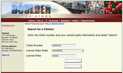
Notice the lovely contrast on the buttons with text and background.

After putting in my license info I get the following:

Holy checkboxes batman!

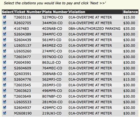
Wooah, this is just a subset of the pages of information on tickets to pay! Oh, I should have said, this is a rental car :)

It appears that people don’t pay for any kind of fines on rental cars. There was over $10k on this puppy. I want to do the right thing though, so I hunt for my issue to pay it. You can see all of the checkboxes though right? Oh, there isn’t a “deselect all” option, so I jump on the TAB + SPACE routine… singing a song to keep the rhythm up. After manually deselecting hundreds of these things. I reselect mine, and click on next, only to see:

Pay for them all??

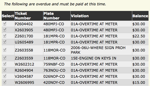
Oh man. I have to pay $6k for the issues that are “over due”. I don’t think so Sherlock!

After all that, I guess it is time to go manual :(

What would I have loved to see?

  • After entering the ticket number and license plate information, “do you just want to pay for this one? or the other 10000?”
  • A de-select all
  • Buttons where the text color and background color aren’t the same

Other Frustrating User Experiences

Aug 15

Frustrating User Experiences: Wordpress Media Upload

Tech with tags: , 6 Comments »

There is a feature that changes every Wordpress release, that always has me wanting to patch. The way media is uploaded never suits my needs. It wasn’t built for me. Back in the day, the upload used to happen on a separate admin page, and then it became inline to the post page itself.

The latest version drives me the most nuts. The problems that I have are frustrating as they take a two click scenario and make it a 10 click one!

My issues:

  • When you click on the media upload it flashes between the browser upload and the Flash one
  • The link URL is to the image itself, when I never want this. I want to link to either none, or to a Web page (the use case shown is for posting a small thumbnail that links to the full size picture)
  • The size defaults to medium, but I always want full size!
  • Insert into post doesn’t do what Blogger does (put it at the top), but rather nukes anything that you have written in your post and replaces it with the image. I have to remember to select-all and copy, then insert, and then copy back in. How often do you want to nuke content in there??
  • Weird classnames applied. I just want a border="0" and a href to the page of my choice.

If I could change the defaults I would be a lot happier. Having to hack the code (which gets more spaghetti each release in this area) is a pain, and a plugin can’t hook in there.

Wordpress Media Upload

Aug 13

Frustrating User Experiences: Red Carpet Club

Tech, UI / UX with tags: 2 Comments »

I am going to start posting some frustrating user experiences as I come across them. Them seem to have happened a lot recently. Maybe it is my mood :)

I was at the United Red Carpet club and a nice lady couldn’t work out why she couldn’t login to the (now) free WiFi. She put in her mileage plus number, and this came up:

Red Carpet Club Error

The solution didn’t take long. I scrolled down the page, which then showed a “Terms and Conditions” area that you had to check. This was awful as the flow is all wrong. You see the area you need to fill in (mileage plus number) and then you see the other option, the complimentary access that doesn’t apply to you. You stop, and you submit the form.

Since you can only submit one of the areas, you could do several things such as:

  • Put the damn terms on top
  • As you fill in one of the forms, the terms popup close by

Here is the full form that makes it obvious:

Red Carpet Club In Full