Frustrating User Experiences: Wordpress Categories
I use Wordpress a lot, and love the product. But, when you are working with something every day, you see its quirks too, such as the Wordpress Media Upload.
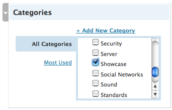
This time though, I have to mention the categories system. In the latest and greatest 2.6.x branch, the admin console got rev’d quite a bit again, and the categories system now has this:

There is some good thinking in here, such as having the “popular categories” filter, but having a huge list of check boxes in a very small area is painful indeed. Scrolling through the list to find the categories that you want it ugly.
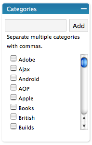
The older version actually suited me quite a bit better:

At least here you had the input text box on the top, so you could type in the items, and then you would see them selected and thrown at the top just to let you know. This was much better. The problem was the fact that a Google Suggest-like auto select wasn’t implemented, so you could get the category wrong… ending up with a new one being created. So close. If you were filtered as you typed I would be happy!
Tag, you’re it!
It turns out that the tag support does all of this. It auto completes for you, and works well enough indeed. I know that there are plugins that munge categories and tags, but maybe it is time for Wordpress to nuke one of them and just unify.

August 19th, 2008 at 1:38 pm
Hey dion,
I agree about finding all wp quirks the more you use it.
When they initially launched tags on wordpress.com I assumed it was targetted at us specifically… “Dog, cat,” in the example below the text box.
The issue for us had to do with finding wordpress before it supported tags, our only option was to use categories. Suggesting we changed, even though I knew we weren’t using the category feature properly we weren’t going to just switch.
Categories and tags both have similar functionality… For a regular user there’s no distinction. The wp team however views categories as a method for organizing posts, and tags for adding meta data about the post.
But in the end… Its still a pain in the ass updating both, or either. And they’ll need to educate users in order for them to remove one.
Eric abuser of cat-egories.
August 19th, 2008 at 10:23 pm
I recently trimmed my category list to only a handful, and re-categorised all my posts under a single category each. It was a long and painful process, but worth it. Now my visitors can easily separate site news from actual content etc, and my tags classify and extend the post for greater exploration. I hope they don’t trash it as readily as you suggest.
August 20th, 2008 at 8:47 am
Eric,
Yeah, being legacy users like us really changes the game doesn’t it. If we were starting again from today, it could be different :)
D
August 20th, 2008 at 8:51 am
joshnunn,
I can see how for some sites that can make sense. But, you could also have another way to say “these tags are main categories” and still have a one dimensional system.
D
September 13th, 2008 at 9:33 am
Totally agree Dion! What is the point of tags and categories?
I was thinking about that the other day in fact. I have found a few problems with the new wordpress like not having the preview while you are writing.
At least inserting images is a bit easier.