I am going to start posting some frustrating user experiences as I come across them. Them seem to have happened a lot recently. Maybe it is my mood :)
I was at the United Red Carpet club and a nice lady couldn’t work out why she couldn’t login to the (now) free WiFi. She put in her mileage plus number, and this came up:
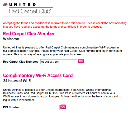
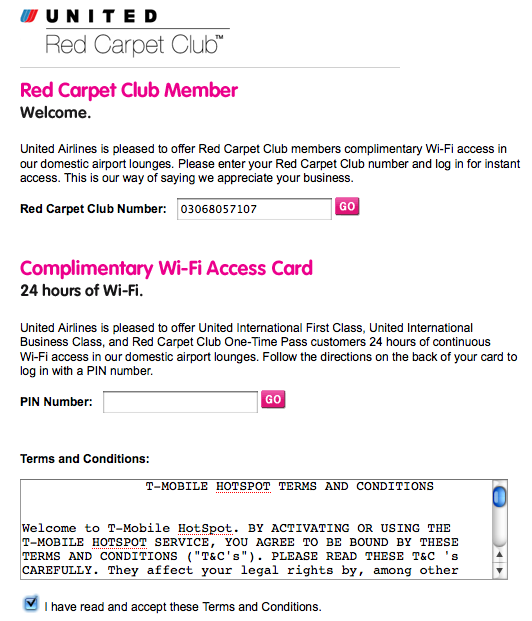
The solution didn’t take long. I scrolled down the page, which then showed a “Terms and Conditions” area that you had to check. This was awful as the flow is all wrong. You see the area you need to fill in (mileage plus number) and then you see the other option, the complimentary access that doesn’t apply to you. You stop, and you submit the form.
Since you can only submit one of the areas, you could do several things such as:
- Put the damn terms on top
- As you fill in one of the forms, the terms popup close by
Here is the full form that makes it obvious:

August 13th, 2008 at 10:59 am
Seems simple enough. I really think these “Check box to accept terms” need to go away somehow anyway. I’d really like to know the statistics of folks who actually read them anyway. Why not just have some verbiage that states by entering your number and clicking go you’re accepting our T&Cs with a link. The world is in need of new UX pattern for this whole thing.
August 14th, 2008 at 12:28 am
I think the best solution is to have the TOC hidden before you hit “GO” on either of the options.