Small feature, huge difference; Correlating entries in FriendFeed
A week or so ago, FriendFeed included a feature that changes the experience for me on the site.
I used to see this kind of stuff all the time:

Many people would Twitter something with a link, and post it to del.icio.us, and blog about it, and also were members of FriendFeed Rooms. This is a poisonous interface, as it gets very frustrating for the user (at least, for me).
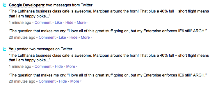
With the new feature, my flow looks like this:

It appears to be quite smart too. It puts together items, kind of like TechMeme, where you see Bob posting to his blog, and then Harry posting about it too appears under that item. It is doing smart grouping, which in turns give you more content.
I would like to see it go further in some ways, and not take up as much space on the “related” line, especially for items that are true duplicates. The algorithm is still getting its grove on, and I often still see the duplicates, but this is a great feature, and knocks down another mini-barrier of my FF usage.
