Nov 21

Enyo shows us a some skin; Sneak peak at a fantastic new mobile Web Touch framework

Mobile, Tech, Web Frameworks, webOS 2 Comments »

The Palm Developer Day in New York City was a ton of fun last weekend. Greg and the events team did a bang up job, and it was a pleasure to continue to hang out with the webOS community. Seeing old friends was great, and finally being able to put a face to a name or a nick was great too (highlighted by meeting Rod Whitby of webOS internals, all the way from down under!) This community sure is passionate.

A strong thread throughout the show was the importance of cross platform solutions for developers. There was great content such as a cross platform framework landscape review, and PhoneGap, and a panel including the likes of Charles Jolly of Strobe/SproutCore.

The icing on the cake though was the coming out party for Enyo (greek goddess of War), a next-generation touch UI framework from HP.

It is important to understand where Enyo came from. A chap called Matt McNulty was one of the reasons why Ben and I joined Palm way-back-when. We had been working with him on a webOS-bespin hybrid which later became the fantastic Ares Web based IDE. The layout system is still best in breed, and being able to deploy from the Web to your phone is just awesome.

Those in the Ajax community, especially Dojo old-timers wouldn’t have been surprised to see this level of polish and innovation. Scott and Steve created the grid that was donated to Dojo.

The team behind Ares were not using the Mojo framework, but rather another one (Opus) that would morph into what we see with Enyo today. Going between an Ares application and a Mojo one has always had friction, but that will all be changed with The Unification happens. You will be able to go between the UI builder tool (Ares) and hand coding, no sweet.

There are a bunch of modern touch UI frameworks these days: Sencha Touch, Sproutcore Touch, iAd JS (really!), jQuery Mobile, and more. I am excited about Enyo being added to this mix. Here is why:

Performance

This has been the number one goal, and I have seen the massive difference that it makes on webOS. Enyo based apps start incredibly quickly and stay smooth. This is an area that webOS needed to improve (performance) and Enyo makes huge strides (especially when you also add the work that the entire platform and apps teams have done). Fortunately a lot of the top frameworks are starting to do a really good job here. They are using similar tricks around: keeping a virtual tree and only going across the DOM boundary as little as possible, trying hard to keep animations and rendering on the GPU and without triggering re-renders whenever possible via CSS3 tricks.

Developer productivity

Ares developers have told us time and again how fun it is to write apps. It is very easy to get going, and this goes beyond the great tools. The Enyo framework itself has some fantastic developer ergonomics, especially around layout and the event design, which also helps make sure that you don’t leak memory (obviously a huge thing on mobile).

Cross device

Another major goal with Enyo is the fact that it has to deal with the number of devices coming out of HP running webOS in the future. This is huge, because a massive pain points for developers right now, and in the coming years even more so, will be the need to handle many resolutions, dimensions, and capabilities for the touch world. By solving this problem in a unique way, Enyo makes this a strength. Scott Miles (or as I call him, The Architect) showed off an email client that is in “phone” mode (list of emails) when in a narrow window, but as soon as it got big enough (say, a tablet size resolution) the layout changed in real-time to offer a different view. Being able to share views, and have magic components that can even do a lot of the work for you, is fantastic when you think of building applications that span mobile and tablet (and others). Beyond this though, what about Web apps? I have often said that I wish that I could run a Twitter app in an IM-like configuration (long thin view) looking like echofon/Tweetie/etc, but as soon as I maximise it or stretch it out, it uses that real-estate to become more like Twitter for iPad or TweetDeck. Enyo makes this very possible indeed.

ASIDE: I had a bit of fun with doing this manually with the “hello world” style site setdirection.com which changes between browser, mobile (including landscape and portrait).

Cross platform

Enyo is too good to be stuck on any one platform. I think that the folks behind webOS know this. Having a set of tools and framework like this available for the Web as a whole is going to add to the growing list of quality frameworks that are available for true touch applications (not just DOM sprinkling libraries).

Having this discipline is also added by the fact that you can then spend most of your time developing in a browser rather than an emulator, and thus use all of the browser debugging tools that are available.

Conclusion

Firstly, congrats to Matt, Scott, Steve, and the entire team for showing us a glimpse of Enyo. I can’t wait to have developers play with it. Go Web.

It is great to see not only PreCentral grok its importance, but also Engadget and others.

Nov 19

Not only are URLs special, but yours is too!

Mobile, Open Web, Tech 2 Comments »

available on the app store

My last post discussed how special URLs are. They are loosely coupled strings of candyfloss and should be loved and respected.

Thus, a trend that I always makes me squirm is “sharecropping” (as Tantek would say) and not giving people your real address. You have all seen it:

  • A TV ad that ends showing facebook.com/toyota instead of toyota.com
  • A newpaper ad that just asks you to “follow” them with their Twitter URL
  • “Check in” on Foursquare
  • I was in a European airport that had billboards showing how to get info via their application that is “Available in the App Store”
  • Remember AOL keywords?

On many of these services you are only renting space. You are sending traffic to the host of the system and helping them with their Google juice. I understand how you think that the hip kids just want to go to your Facebook page, but why not send them to your own URL that can deliver an experience that makes sense for them?

You get a lot of benefit:

  • You are building your own SEO juice
  • You inviting the user to your own house, and can thus own the relationship
  • As a good host, you can choose the experience that you want to offer. For example, you can deliver an experience that makes sense for the given device AND what you have to offer.

This isn’t to say that you should tell the user where you are on the various services where they hang out.

delta-downloadtheapp

I prototyped App Discover as a way to do the marriage between the users devices and what you have to offer. Hopefully sites will grow intelligence to give you an easy way to not keep telling you “download the app!” when you visit the site through your mobile device. The Delta mobile site throughs the above in your face, and since they have no way to query the system to check “hey, if the user has already installed the app, don’t bug him”, it bugs you. I always find it strange to open up the App Store itself and see it tell me about apps that I have already installed. Really? A lot of work to be done on discovery.

I think it is time to take some ownership of your URL, and treat it like a garden. Keep working on it.

Oct 26

Will combining your voice with your motor skills be a UX boon?

Mobile, Tech, UI / UX No Comments »

monkey at computer

I have a love hate relationship with autocorrect. When you type gibberish and it automatically converts to what you really meant you let out an “ahhhh”, but when you type something correctly and the system gets in your face and switches it over to something else you get mad. I find that I often know when this is going to happen. When “almaer” turns to “Almaer” in a case sensitive field I growl loadly.

Google acquired BlindType (video above), which is one example of dealing with this particular issue, and it is great to see technology in this space (e.g. Swype). I am sure we will see a lot of new technology come around to make life easier for those who want to quickly navigate around, or get a bunch of content into the device. Have you ever wanted to reply to an email while mobile with something of substance and be frustrated, knowing that you will have to hammer out the thing on a small keyboard? I have. Using voice input has been very mixed, to a point where I don’t try it.

I got thinking about how I would love to be able to use voice actions whilst typing. After all, we do that in other ways. Look at an Italian using his hands as he talks, or a radio DJ make changes as he raps. My particular urge was to say “set spellcheck off” as I typed something onto the device that I knew it would want to correct. Once I did this once, it kept coming to mind as I did other things. When in the browser opening new tabs, sometimes I want to open them up in the background, but other times I want to open them in a new tab but jump right to it. The browser could give me a slightly different key combo for that, or I could say something like “jump” as I complete the action in question.

Once you know that you don’t have something that you want, it is frustrating. I showed someone how they could hold down the home button on iOS and speak to the system “call Dion Almaer mobile” worked like a charm. They then tried “open Facebook”, but to no avail. It feels like it is only time for systems to open up voice as a first class citizen here. Any third party application should be able to add their own voice commands into the substrate.

Once again I feel like an ape at my computer. I can poke and ug (point and click), and I am starting to be able to do more touch, but let me speak and use other senses! SmelloKit where are you?!

Aug 31

Node is our turtle shell; Node.js now powers services on webOS

JavaScript, Mobile, Open Source, Palm, Tech, webOS with tags: 3 Comments »

ryannode

At our last Palm Developer Day, Ben and I discussed future APIs for webOS including “JavaScript services” as a way to write code that runs on the other side of the device service bus using JavaScript.

If you think about it, node delivers a services platform for the cloud, so is there a way that we could work together? We got together with Ryan Dahl of Node to try this out, and it turns out that node works fantastically well on a mobile device! Major kudos should go to the V8 team for creating a great VM and to Ryan for writing efficient code that scaled down from the cloud to the device.

Today we announce that node is part of webOS 2.0:

The popular Node.js runtime environment is built into webOS 2.0, which means that you can now develop not just webOS apps but also services in JavaScript. The active Node ecosystem is on hand to provide community support and a rapidly growing library of modules that you can use in your webOS services.

Besides powering the new Synergy APIs, JavaScript services strengthen webOS’s support for background processing and add new capabilities—like low-level networking, file system access, and binary data processing—to the web technology stack.

I am really excited about this move for us. The node community is top class. I get to see this time and time again, most recently over the weekend and this week as I judge the node knockout. There is magic in the air with Node. It feels like the Rails days. I remember being so happy to jump to Rails and get away from the heavy world of Enterprise Java. It was a breath of fresh air to not have to argue with folks about every piece of the stack. “What about JSF with HiveMind and Commons-Logging and ….” Argh! Too. Much. Choice. And, a logging abstraction above Log4J was hilarious :)

Node is low level, yet simple. It is more like Sinatra than Rails. The event-based opinions keep you in good stead, and with cloud solutions such as Heroku and no.de you have great deployment stories, unlike Rails back in the day.

If you check out the modules that are growing daily, and the fun real-time hacks from the knockout you will get a good feel for node.

It feels great to have webOS as the first mobile device that embeds node. With db8 we offer a JSON store than can sync to the cloud (e.g. sync with CouchDB). This stack is starting to look pretty great.

Aug 31

App Stores: Showing users the value of Farmers Markets compared to Wal-mart

Mobile, Mozila, Open Source, Tech with tags: 1 Comment »

applesfarmersmarket

I remember growing up walking past grocers and butchers, and having my Mum stop by to get fresh meat and veg on a daily basis. I look back fondly on that experience, as I contrast it to the later years of mega-stores. When I came back to England for a year stint, a few years back, I was shocked to see that Tesco didn’t just sell food anymore, but had branched out to credit cards and gas and lots of crazy things.

The local stores have been wedged out.

On Sunday, I took my kids to the farmers market (happens most weekends), which is what had me think back to the local stores from my own childhood.

I worry about the food chain these days.

Another sector that I think about is app economies and app stores. I have talked about what an open marketplace could be and Pascal Finette of Mozilla Labs has been doing a lot of thinking in this area.

Fast forward a few months, and we see a new project in a very early stage. Vapour (github repo has been removed) is the Mozilla Labs project that is “An experiment around an Open Web App Store.” I am excited about the project for two reasons:

  • Mozilla is uniquely positioned to deliver a marketplace that focuses on very different values than other companies
  • I see check-ins from two amazing people: Michael Hanson (who did the amazing work around “people”) and Lloyd Hilaiel (who recently joined Mozilla. I tried to hire him there years back, and he waiting for me to leave. Hmm :)

Also, I got to hang with the OpenAppMkt chaps at the Node Knockout get together last night. They have only just begun, and think they will do some great things.

I evangelize the farmers market. I market it. I try to sell it.

I think of the Mozilla effort as the farmers market of app stores. The values are different. It isn’t just about values though, it will be about product. Many folk go to the farmers market because the goods are better. It is incredibly hard to compete with the likes of Walmart. They squeeze the market and force their vendors in a race to the bottom around price. This is the trick that Walmart can play. They can hold on to: “Look, we are giving everyone cheap goods!” It doesn’t matter what they do with China, or how they treat workers. Surely it is all for good if we can get things cheap right?

The same is happening with the major app stores. These platforms sell consumers with a fantastic user experience and looking after their users. No viruses. No “bad stuff”. Clean. They offer true value, but there is always a cost.

The app markets are as strong as wal-mart. I am excited to see new endeavors that change the game and deliver great user value, while also giving great freedom.

May 07

Watching you Mum use the iPad is fascinating :)

Mobile, Tech, UI / UX 1 Comment »

I got my Mum an iPad. I wanted to get one for her more than me (even though I got one too of cos ;) as it seemed like a perfect tool for her to consume content. Finally, I get to hand her something that won’t just break. She doesn’t need to be scared to use the device. One button. So much simpler for her than a normal computer.

She has loved it. My Dad has told me that she is always on it. This week she flew in and stayed with us, and I got to watch her use it first hand, and it was fascinating.

I had my brother setup the device for her first time around. He installed a bunch of apps, and must have shown her how to add a bookmark to the home screen. I say this, because when I asked her whether she had the Foo app, and she said “Yup, here it is.” However, it wasn’t that app at all, but rather foo.com saved onto the home screen. She had no idea that there was a difference! Now, I personally believe that the world of URLs on the device vs. apps should entirely blur…. but it already had to her! I then had to show her the “App Store” and how to install apps.

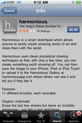
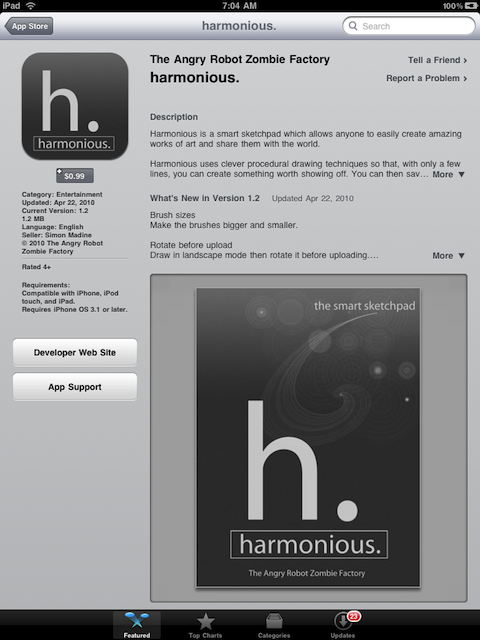
This is when I learned how poor the UX is for downloading and installing apps. I have thought this before, but didn’t realise how bad it truly is until I watched my Mum.

She had NO idea how to install an app. She could find them, but couldn’t install them. It turns out that the UI for doing an install is incredibly poor. You have to know to tap on a small [FREE] or [$1.99] button which then turns into the [INSTALL] button. It is small, and not obvious at all. I wonder why Apple hasn’t noticed this and made a more obvious [TAP HERE TO INSTALL THE APP] flashing green button?

This is bad on the iPhone:

iphonestore

But with large real estate on the iPad, it is really hard to find:

ipadstore

It is also hilarious when you see someone struggling on what to do with a device that has ONE button. I love you Mum. Thanks for letting me see a UI through different eyes this week. I hope you continue to enjoy the iPad!

Apr 30

More mobile UX; The power of dashboards, notifications and raw beauty

Mobile, Tech, webOS 3 Comments »

As webOS grows up, developers learn more about the platform, and together we build commonality into our apps. I have talked about various gestures and practices that are both built in, and have emerged.

I have seen some very interesting advanced uses of our notification system recently and wanted to share.

birdwatch

First up is birdwatch a “background app” that polls your Twitter account and when new tweets come along, they are shown in a dashboard component at the bottom of the screen. You can simply tap that area to move through your tweets. Very nice indeed, and something I would love to see in our email client, and in the Facebook app. The feature has been added to our list.

It is a great and simple example of how you don’t need a full app for every use case, and remember: those areas are DOM windows too so you can make them do a lot! We have seen other core examples such as the media player controls, and I also look forward to seeing the Facebook app be able to accept/deny friend requests right there. What would your users want to do rather than be sent into the main app indeed? That is the question.

jotit

Then we have Jot It, a note taking application. What makes it different is again in the dashboard area. When the dashboard is activated you see a bottom UI bar that gives you quick access to your documents. A creative way to add the UI.

It does have issues, in that you only really want this if you REALLY care about notes :)

tweetme

Back to Twitter. I have really been enjoying Tweet Me a new application that just got released into the catalog today.

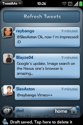
One feature that fits into the notifications meme is the banner notification UX flow. If you type in a tweet and back gesture away instead of a dialog “are you SURE you want to leave that info?” the app does something very nice indeed. It saves a draft AND gives you the option to delete that draft right in the banner. It’s a small thing… but one of those touches that shows that the developer really sweats the small stuff.

I am really excited about this application in general. It is beautiful and really showcases how webOS apps can be gorgeous. The technology is there, and this app raises the bar for all webOS applications.

Check out the splash screen, the favorite tweet star animation, picture thumbnails and more. Take a quick look at the flow below:

Man, we have an amazing set of Twitter apps now. They each have their own feel and niche too. Bad Kitty is fantastic. And then there are Tweed and Twee and Spaz (fully open source) ….. the list keeps growing. A strong bench.

What other mobile apps are inspiring to you? Other practices?

Apr 28

Just Type. One of my favourite platform metaphors.

Mobile, Tech, UI / UX, webOS 7 Comments »

type

In my feeling touch-y post on some of the fun usability issues and opportunities, I touched on shortcut keys.

As I have continued to learn more about the webOS platform, one of the biggest changes for me has been knowing that a physical keyboard is available.

gesture-facebook

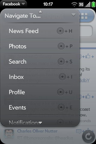
This is why we put in shortcut keys for the Facebook app. I can now very easily jump to an area of the application by touching the gesture area and pushing a key. I would love to see shortcuts available in many other webOS apps, and a “GreaseyPalm” (greasemonkey type system on webOS) would be awesome… enabling me to easily tie my own in… but that is another story :)

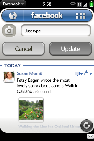
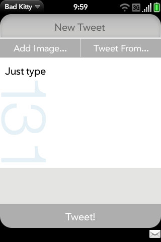
Other than shortcut keys though, I have found more and more applications using the “Just Type” metaphor. It turns out that many apps can be smart about what a user would want to do if they just type.

justtype-facebook

We implemented this on the Facebook app. If you are on the news feed and you start to type, assume that this is a status update, pull up that UI and put the content in there.

justtype-badkitty

Bad Kitty and other Twitter clients do a similar thing for assuming that you want to Tweet something.

justtype-launch

My favourite example is in the core launcher itself. I remember being incredibly frustrated with home screen layout on the iPhone, and on webOS at first. Having to move icons around on the phone is a pain. I was excited when they added the ability to manage apps in iTunes, but the UI manages to be just about as frustrating in there.

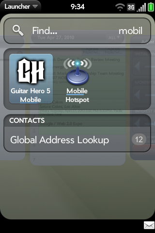
It took me awhile to realise that I don’t need to use the launcher in this way at all. I can just type, and it will find the app I want. Hmm, where have I seen this before? Quicksilver! Ubiquity! Those examples go even further and offer actions that are even pluggable and scriptable… which would be awesome on a mobile device too.

This is yet another item on my checklist when I build an app. If the user started to type right now, could I do something smart that just works?

Just Type. Check!

Implementing Keyboard Shortcuts

A few folks asked about keyboard shortcuts. To implement them a la Facebook, you simply use the shortcut attribute for actions in the

        var appMenuModel = {
            items: [Mojo.Menu.editItem, {
                label: $L("Preferences & Accounts"),
                command: Mojo.Menu.prefsCmd
            },
            {
                label: $L("Navigate to..."),
                items: [
                {
                    label: $L("News Feed"),
                    command: "gotoNewsFeed",
                    shortcut: 'h' // H = home
                },
                // ...
                ]
            }
         }
Mar 03

Facebook in your Palm; Fun building the new Facebook app

Mobile, Tech, webOS with tags: 27 Comments »

facepalm

When Ben and I joined Palm to run Developer Relations, we knew that we wanted to eat dogfood pretty quickly. We have had some mobile related projects in the past, but they were either mobile Web sites, or Java based. Being able to take our web skillz to rich mobile devices was much more new and exciting.

Building sample code and apps is useful for developers, and the team will be doing plenty of that (e.g. this is how you use the awesome List widget in every which way, and why you would do X, Y, or Z) but building a production app is a whole different level.

We wanted to learn what it is like for our developers to design, build, and distribute webOS applications. We could have started with a smallish app, but no :) Instead we took the great work of Justin Newitter (who built the original app) and went running with an updated Facebook app. Along with other great developers in the dev relations world, we have gotten our first early release out there today.

Here is a walk through of the app by PreCentral:

We have definitely learned a lot in our short time on the app, and this is the first release of many. I really want us to have a regular cadence to our releases. If there is a feature you are excited about let us know.

fbpixi

We added a broad feature set to the application. The first Facebook application was very much about synergy. Why put something in an application silo when you can bake it into the platform? I still contend that webOS is the best platform for Facebook users as it integrates throughout. Other mobile platforms do some of this, but I think we continue to do the best job here.

There are a bunch of Facebook features that our users still wanted though, so we worked with Facebook themselves to prioritize this list. The top features were access to Facebook Mail, full profile access (info, wall, and photos), people search, events and birthdays. We also wanted to do interesting things to the UI as we bring in these features. Oh, and a couple of mini-easter eggs.

Designing the application was challenging and a lot of fun. At a high level, working out a design that is true to webOS *and* a strong brand such as Facebook was a balancing act. You will run into this same issue even without a brand like FB. How does it have your DNA and still fit in with the core platform. This has been a design consideration since the dawn of time. Do you make a clean Mac app that looks like Mail.app? Do you do your own UI that looks like a funky Flash UI? Most of the time you are in the middle.

fbappnav

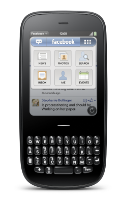
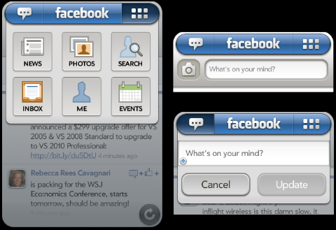
One feature that we spent time on was the base navigation. We wanted to make it incredibly easy to get to features you use often, and also quick to get to all features.

We ended up with a solution that made the following decisions:

News as Root

The root of the application is the news feed. Some Facebook apps have an icon window as the root, but we decided to behave more like the Facebook website itself. The news stream is the blood line, so start there. No matter where you go in the app, if you back gesture away…. you will always end up at the news stream.

Also, just like the iPhone app, we share the shake gesture as a way to refresh the data here. Shake away.

Status Matters

webOS devices have hardware keyboards and are great for creating content. In the Facebook context this means updating your status and uploading photos are prime ways to get your content into the system.

For this reason the top left area is your way to always get to your current status and update on it. In fact, if you are on the new stream, just start typing and the update area will pop down and capture your new status (while showing your last one below).

Also, if you click on the camera icon, you are sent into the core photo experience on the device which natively supports uploading to Facebook.

The Navigation Grid

For all other features, we wanted to give you a quick way to access them. Click on the top right grid and a pop down will immediately appear, giving you one tap access to any feature. No need to switch to a navigation screen first.

We are also playing with the ability to use that hardware keyboard by giving you quick key access to any feature (e.g. SYM + E == sends you to events). Is that a good idea?

Facebook Logo Power

The Facebook logo itself has some hidden love. In an homage to to websites, a tap on the logo takes you home…. which means back to the news stream. If you are on the news stream already, and have flicked down…. that same logo will bring you to the top.

Where to go next?

We are excited to offer access to data that Facebook users haven’t been able to get in an app before, but where do we go from here?

We definitely want to do a lot of polish on various sections that we have out there. One idea that I have been playing with from the get go is doing something immersive when you rotate the screen when in a news feed. Instead of just having the news feed work in that format, what if the content took over. I mentioned this in my last post about touch UI. I flick through the stream and if on photos, the album takes on the entire screen for example.

There are some other really fun features that revolve around webOS notifications and giving you a great way to “never miss a thing” (life moves fast you know ;) and choosing what content matters to you.

And, finally, we have to work out what makes sense in an app, and what could be baked into the platform. Giving access to birthdays is great, but would you like to have them as a calendar on the device? Maybe, but you would definitely want to be able to turn that view off…. and in fact you may already have birthday info in your profiles, so we should have one unified birthday view. Life gets more complicated when you go to the generic doesn’t it.

Again, we have just started here, but would love to hear from you on our feedback area in the app page.

Thanks to the team that played a part in this release! We haven’t reached Joe Hewitt foo yet, but we are having fun!

Feb 24

Feeling Touchy; Learning how to build great touch UI

Mobile, Tech 7 Comments »

As you move to a new platform, it is interesting to watch your brain morph over time. I remember switching from Windows to Mac. At first the fonts looked blurry and weird. The mouse pointer didn’t weight right. The constant app menu was strange. There were things I liked about it right away, but they were mostly the fact that I had a command line, and the fact that apps were minimal, pretty, and useful.

Over time though, I grew to like the Mac more and more. A few months in and it was the Windows fonts that looked too sharp and weird.

I am going through the same experience with webOS and the iPhone. It took me awhile to get used to the back gesture on webOS and not look for a back button. Now I know how to organize my multiple windows, and use universal search as my quicksilver, and so much more. When I open up my iPhone now I am at the point where I try to do a back gesture by mistake. webOS is a touchier, needier device, and as I develop apps and play with the platform, I start to grok that more and more.

Embrace the touch

I discussed touching and horizontal scrolling awhile back, but the more I play with touch devices, the more I find myself wanting to build features for the touch. I have a ton of learning, but here are some of the lessons so far:

Native UI or Immersive UI

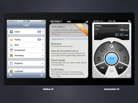
One decision that you have to make when you start building your application is the style of UI. Do you want a native looking UI for the given platform?

native-immersive-ui

Everyone jumped on native off the bat. We quickly saw libraries such as iUI come out that let you mimic the iPhone UI. Having a native UI can be important. You want to fit in. However, we have also seen the growth of immersive UIs. Convertbot is the example above on the right. It is task based and you feel like you are really interacting with the app. It is almost tactile.

gmail-nativemail

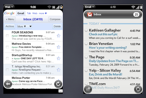
It is interesting to compare the Gmail and native Mail client UI in webOS. The Gmail version is deployed via a website, whereas the native version is of course an application, but they are very similar. Both use HTML/JS/CSS. Both have their look and feels. Do you try to look like your website (e.g. Google look and feel), or do you try to go fully native. The blending of the two gets interesting. Your brand has to live in another native world.

Haptics and touch feedback

It is usability 101 to make sure that you are always giving users feedback on their actions.

First, how do we signal to users that there are particular touch areas? This one is a bit of an art. We don’t really have :hover and the like. I actually like the idea of having a long press show helpful information, but users aren’t used to using that ability yet (see: need more gestures!).

Where we do have touch areas, we need to make sure to have various depress states for the touch.

Users will touch all over the app, so think about what you can do where.

We are going to see haptics in the future. For now it feels like haptics are used like this:

james-haptics-robot

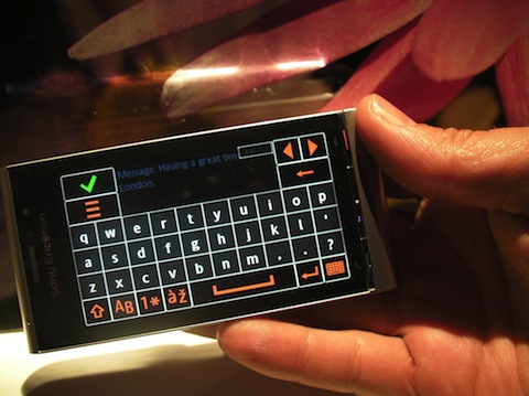
But the science is coming along. Sony Ericcson has a device (Satio) with haptic support for example:

sony-satio-haptickeyboard

Using the Keyboard: Software or hardware

This brings us to keyboards. What is the optimal input for your application use cases.

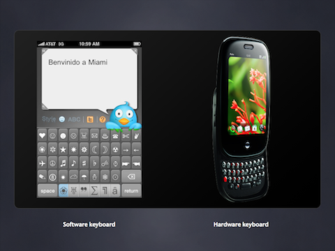
keyboards

Feathers by Aral Balkan is a good example of both the task based nature of mobile apps, and custom software input. I like how Aral thought to create an app that solely creates Twitter messages. He didn’t create a full Twitter client that would do it all.

And if you have the pleasure of a hardware keyboard, how can you use that beyond the obvious inputting of text fields. The beauty of a keyboard that come out is that it doesn’t take away space from the screen. Could you offer short cut keys in the app? Different navigation? There is a lot more to explore here.

Gestures. Time to catalog and create new standards

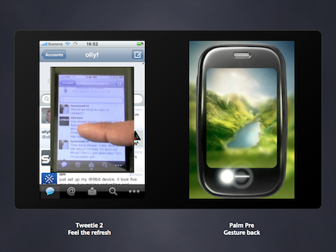
gestures

We are seeing more and more gestures in applications. It feels like we are building out the standards right now. What will be the Ctrl-C’s of mobile? We get to build out invisible ways to navigate.

Tweetie 2 did something interesting when it threw away the refresh button and replaced it with the pull down. Isn’t it more work? Some people don’t like it (Jimmy Fallon for one!) but a lot of people find it more gratifying because it is more natural. We have buttons in the real world, but the apes in us are more used to touching the world around us in very different ways? This is one example of going back to our roots.

shake

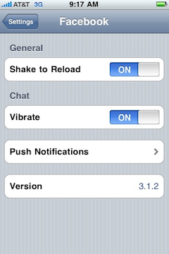
Speaking of reload, we are seeing another common gesture here too. Using “shake” to reload, or relayout.

Orientation: Try to accept them, and be more creative

orientation

Have you ever turned your device on its side and not seen anything happen? That frustrates me. At the least, we need to rotate the UI and let it continue. But, can we go beyond that? I have been playing with this. What if landscape brings a more immersive experience?

Take an app that loads a stream (e.g. Facebook, FriendFeed, Twitter, whatever). In landscape, you can view one entry at a time. If the type of entry contains a photo album say, take over the full screen to show the photos and let you flick through.

It really is fun to play with touch apps these days, and I get the feeling that we are still in the dark ages wrt our interaction models.

What patterns have you enjoyed in using and building mobile apps?