I got my Mum an iPad. I wanted to get one for her more than me (even though I got one too of cos ;) as it seemed like a perfect tool for her to consume content. Finally, I get to hand her something that won’t just break. She doesn’t need to be scared to use the device. One button. So much simpler for her than a normal computer.
She has loved it. My Dad has told me that she is always on it. This week she flew in and stayed with us, and I got to watch her use it first hand, and it was fascinating.
I had my brother setup the device for her first time around. He installed a bunch of apps, and must have shown her how to add a bookmark to the home screen. I say this, because when I asked her whether she had the Foo app, and she said “Yup, here it is.” However, it wasn’t that app at all, but rather foo.com saved onto the home screen. She had no idea that there was a difference! Now, I personally believe that the world of URLs on the device vs. apps should entirely blur…. but it already had to her! I then had to show her the “App Store” and how to install apps.
This is when I learned how poor the UX is for downloading and installing apps. I have thought this before, but didn’t realise how bad it truly is until I watched my Mum.
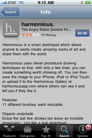
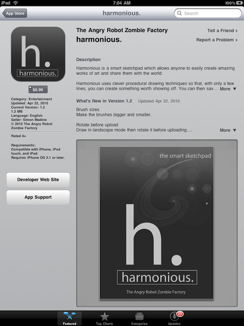
She had NO idea how to install an app. She could find them, but couldn’t install them. It turns out that the UI for doing an install is incredibly poor. You have to know to tap on a small [FREE] or [$1.99] button which then turns into the [INSTALL] button. It is small, and not obvious at all. I wonder why Apple hasn’t noticed this and made a more obvious [TAP HERE TO INSTALL THE APP] flashing green button?
This is bad on the iPhone:

But with large real estate on the iPad, it is really hard to find:

It is also hilarious when you see someone struggling on what to do with a device that has ONE button. I love you Mum. Thanks for letting me see a UI through different eyes this week. I hope you continue to enjoy the iPad!

May 7th, 2010 at 5:15 pm
All that screen real estate on the iPad and they couldn’t figure out a better CTA for installing? At the very least they could add a third big gray button labeled “Install this App”.
Considering how obsessive Apple is about user experience, it’s pretty surprising that they would fail to optimize the final step in a conversion. It’s like throwing away free money.