As you move to a new platform, it is interesting to watch your brain morph over time. I remember switching from Windows to Mac. At first the fonts looked blurry and weird. The mouse pointer didn’t weight right. The constant app menu was strange. There were things I liked about it right away, but they were mostly the fact that I had a command line, and the fact that apps were minimal, pretty, and useful.
Over time though, I grew to like the Mac more and more. A few months in and it was the Windows fonts that looked too sharp and weird.
I am going through the same experience with webOS and the iPhone. It took me awhile to get used to the back gesture on webOS and not look for a back button. Now I know how to organize my multiple windows, and use universal search as my quicksilver, and so much more. When I open up my iPhone now I am at the point where I try to do a back gesture by mistake. webOS is a touchier, needier device, and as I develop apps and play with the platform, I start to grok that more and more.
Embrace the touch
I discussed touching and horizontal scrolling awhile back, but the more I play with touch devices, the more I find myself wanting to build features for the touch. I have a ton of learning, but here are some of the lessons so far:
Native UI or Immersive UI
One decision that you have to make when you start building your application is the style of UI. Do you want a native looking UI for the given platform?
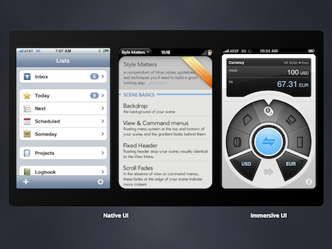
Everyone jumped on native off the bat. We quickly saw libraries such as iUI come out that let you mimic the iPhone UI. Having a native UI can be important. You want to fit in. However, we have also seen the growth of immersive UIs. Convertbot is the example above on the right. It is task based and you feel like you are really interacting with the app. It is almost tactile.
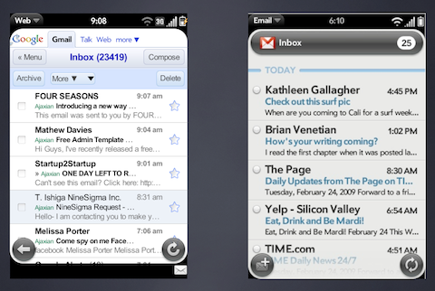
It is interesting to compare the Gmail and native Mail client UI in webOS. The Gmail version is deployed via a website, whereas the native version is of course an application, but they are very similar. Both use HTML/JS/CSS. Both have their look and feels. Do you try to look like your website (e.g. Google look and feel), or do you try to go fully native. The blending of the two gets interesting. Your brand has to live in another native world.
Haptics and touch feedback
It is usability 101 to make sure that you are always giving users feedback on their actions.
First, how do we signal to users that there are particular touch areas? This one is a bit of an art. We don’t really have :hover and the like. I actually like the idea of having a long press show helpful information, but users aren’t used to using that ability yet (see: need more gestures!).
Where we do have touch areas, we need to make sure to have various depress states for the touch.
Users will touch all over the app, so think about what you can do where.
We are going to see haptics in the future. For now it feels like haptics are used like this:
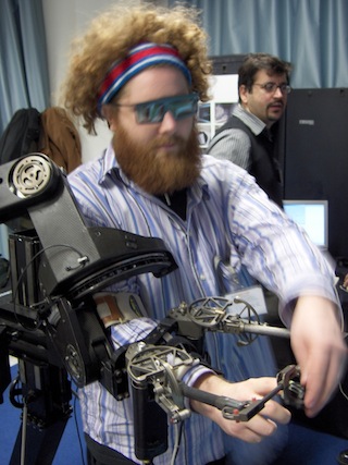
But the science is coming along. Sony Ericcson has a device (Satio) with haptic support for example:
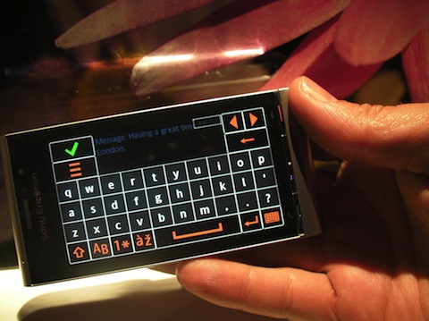
Using the Keyboard: Software or hardware
This brings us to keyboards. What is the optimal input for your application use cases.
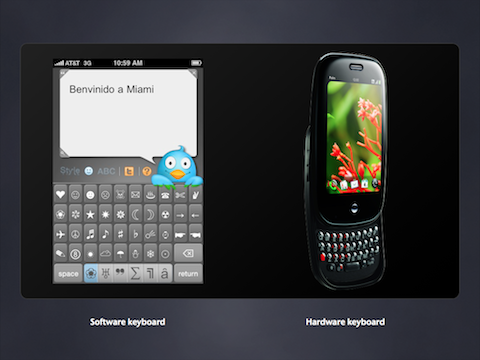
Feathers by Aral Balkan is a good example of both the task based nature of mobile apps, and custom software input. I like how Aral thought to create an app that solely creates Twitter messages. He didn’t create a full Twitter client that would do it all.
And if you have the pleasure of a hardware keyboard, how can you use that beyond the obvious inputting of text fields. The beauty of a keyboard that come out is that it doesn’t take away space from the screen. Could you offer short cut keys in the app? Different navigation? There is a lot more to explore here.
Gestures. Time to catalog and create new standards
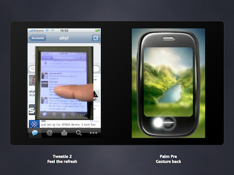
We are seeing more and more gestures in applications. It feels like we are building out the standards right now. What will be the Ctrl-C’s of mobile? We get to build out invisible ways to navigate.
Tweetie 2 did something interesting when it threw away the refresh button and replaced it with the pull down. Isn’t it more work? Some people don’t like it (Jimmy Fallon for one!) but a lot of people find it more gratifying because it is more natural. We have buttons in the real world, but the apes in us are more used to touching the world around us in very different ways? This is one example of going back to our roots.
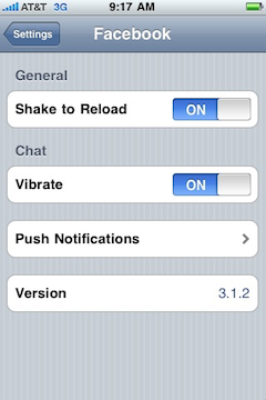
Speaking of reload, we are seeing another common gesture here too. Using “shake” to reload, or relayout.
Orientation: Try to accept them, and be more creative
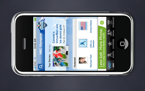
Have you ever turned your device on its side and not seen anything happen? That frustrates me. At the least, we need to rotate the UI and let it continue. But, can we go beyond that? I have been playing with this. What if landscape brings a more immersive experience?
Take an app that loads a stream (e.g. Facebook, FriendFeed, Twitter, whatever). In landscape, you can view one entry at a time. If the type of entry contains a photo album say, take over the full screen to show the photos and let you flick through.
It really is fun to play with touch apps these days, and I get the feeling that we are still in the dark ages wrt our interaction models.
What patterns have you enjoyed in using and building mobile apps?

February 25th, 2010 at 6:00 am
It frustrates me too when I see the picture inverting when I turn my camera in different directions. Why not to implement this simple thing in mobile devices? Everything is still very unnatural.
March 23rd, 2010 at 5:22 pm
I read this entry last month, and said to myself “Outline Tracker could display more detail on an item when you rotate the device!”. Take a look at 1.3, which I just submitted today.
March 23rd, 2010 at 9:33 pm
Doug, awesome! Great work on the new version….
January 14th, 2011 at 3:38 pm
Great website mate. I have been browsing through your posts, excellent work. Keep up the good work.
In regards to the touch UI, I really like the Blackberry models which provide ‘feedback’ (Vibrations) when you touch the screen. Amazing !
April 9th, 2011 at 12:01 am
I was told that kids are your best testers if you’re going for an intuitive interface. If they can’t figure out how to make your stuff work without a manual, adults will be dead in the water, too. If they’re having so much fun they don’t want to give your hardware back, you’re on to a winner.
April 9th, 2011 at 12:43 am
I can’t figure out why Palm only lets me have 4 icons on an otherwise blank desktop. If I want more, I have to look at a long list of apps. Every other desktop on the planet lets me plop down as many icons as I wish.
March 23rd, 2012 at 8:06 am
I had the same experience with switching to a Mac. Now, I would never go back. Most web application developers use Macs as well. I agree with what Samuel Sobart says about kids being the best testers. My brother is starting to develop games for iPhone and Android, and he always have kids test them out.
–Moe