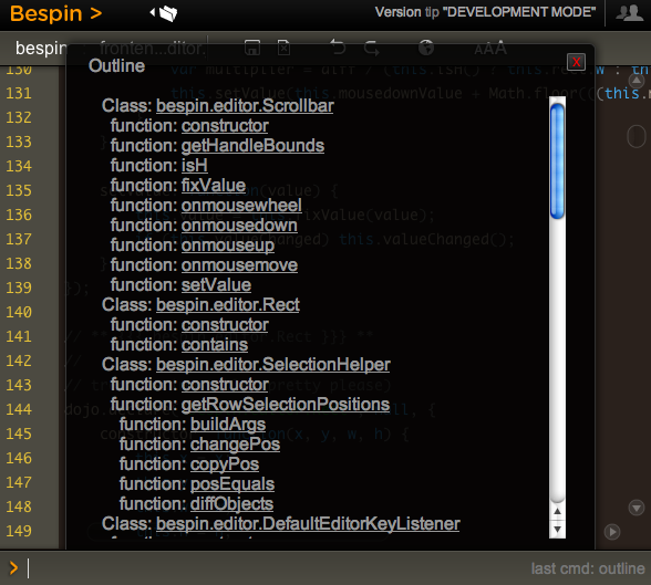
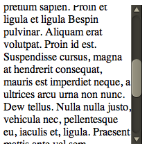
Have you tried to create a nice rich experience and then been fighting the “defaults” to go the extra mile? This reared its head with me recently with Bespin. There are certain commands that pull up divs of content and we need to scroll through it. The problem is that the native scroll bar looks so out of place:

WebKit recently released the ability to style scrollbars in HTML elements (but not the main window, which you have been able to do in IE for donkeys years much to many peoples chagrin).
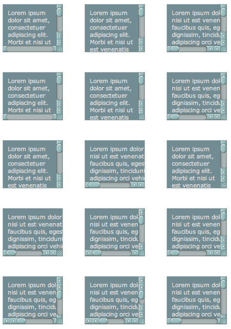
I decided to take it for a spin and loaded up the examples that show you being able to do every type of scrollbar that you can imagine:

So, it shouldn’t be so hard should it. From the blog post I see a few magically ::-webkit-scrollbar CSS properties that I can plugin and be on my way. But looking at the example view source you see many pieces like this:
:not(.none):not(.double-start)::-webkit-scrollbar-track-piece:vertical:end:single-button,
:not(.none):not(.double-start)::-webkit-scrollbar-track-piece:vertical:end:double-button,
.single::-webkit-scrollbar-track-piece:vertical:end,
.double-end::-webkit-scrollbar-track-piece:vertical:end,
.double-both::-webkit-scrollbar-track-piece:vertical:end {
    margin-bottom: -6px;
}
Holy pseudo classes batman! To be fair, this is partly due to the example page having many types of scrollbars in one (hence the not this and not that but the other) but there are still nested classes that you need to grok to get this going.
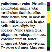
I quickly built a debug scrollbar where I styled the various pieces with simple colors and borders so I can see which was which. I also went about making the scrollbar have one up arrow on top, and one down arrow on the bottom.

The parts and pieces of a scrollbar are quite simple:
- Thumb: This is the piece that shows you where you are in the scrollbar. This is the chap that you can move around
- Track: This is the area of the scrollbar that you can move the thumb up and down, or along (depending on the orientation). There is both the area between the top and the thumb, and between the bottom of the thumb and the bottom of the scrollbar
- Buttons: There may be buttons that you can click to increment or decrement the selection (which moves the thumb). There are various styles (single button, double button, etc)
- Resizer: This can change the are of the element (e.g. enlarge of shrink)
- Corner: This area may show up with both horizontal and vertical scrollbars open
The debug scrollbar kinda shows these areas off in a simple visual way. Note how using display: block|none enabled me to setup the single button on top and bottom functionality:
/* Turn on a 13x13 scrollbar */
::-webkit-scrollbar {
    width: 13px;
    height: 13px;
}

::-webkit-scrollbar-button:vertical {
    background-color: red;
    border: 1px dashed blue;
}

/* Turn on single button up on top, and down on bottom */
::-webkit-scrollbar-button:start:decrement,
::-webkit-scrollbar-button:end:increment {
    display: block;
}

/* Turn off the down area up on top, and up area on bottom */
::-webkit-scrollbar-button:vertical:start:increment,
::-webkit-scrollbar-button:vertical:end:decrement {
    display: none;
}

/* Place The scroll down button at the bottom */
::-webkit-scrollbar-button:vertical:increment {
    background-color: black;
    border: 1px dashed blue;
}

/* Place The scroll up button at the up */
::-webkit-scrollbar-button:vertical:decrement {
    background-color: purple;
    border: 1px dashed blue;
}

::-webkit-scrollbar-track:vertical {
    background-color: blue;
    border: 1px dashed pink;
}

/* Top area above thumb and below up button */
::-webkit-scrollbar-track-piece:vertical:start {
    border: 1px solid #000;
}

/* Bottom area below thumb and down button */
::-webkit-scrollbar-track-piece:vertical:end {
    border: 1px dashed pink;
}

/* Track below and above */
::-webkit-scrollbar-track-piece {
    background-color: green;
}

/* The thumb itself */
::-webkit-scrollbar-thumb:vertical {
    height: 50px;
    background-color: yellow;
}

/* Corner */
::-webkit-scrollbar-corner:vertical {
    background-color: black;
}

/* Resizer */
::-webkit-scrollbar-resizer:vertical {
    background-color: gray;
}
By moving the scrollbar around I could quickly see how this all worked, and it got me to this point which enabled me to plugin the images to make this puppy work for Bespin:

There were a couple of key tweaks needed to make this work:
Getting the buttons working
I used the same trick used in the debug example to turn on the up area above, and the down area below, and then it was just a matter of targeting the correct area for the arrow images:
/* Turn on single button up on top, and down on bottom */
::-webkit-scrollbar-button:start:decrement,
::-webkit-scrollbar-button:end:increment {
    display: block;
}

/* Turn off the down area up on top, and up area on bottom */
::-webkit-scrollbar-button:start:increment,
::-webkit-scrollbar-button:end:decrement {
    display: none;
}

/* Place The scroll down button at the bottom */
::-webkit-scrollbar-button:end:increment {
    background-image: url(images/scroll_cntrl_dwn.png);
}

/* Place The scroll up button at the up */
::-webkit-scrollbar-button:start:decrement {
    background-image: url(images/scroll_cntrl_up.png);
}
Get the track pieces to show
Next up was getting the gutter to show up. As mentioned early on, there is one track, but two areas that can show…. before the thumb and after. You can target these areas via -webkit-scrollbar-track-piece:start || :end and then it is a matter of using the multiple background ability available in new browsers. First we have the top of the gutter, and then a recurring background (and the same for the bottom). This way it just grows with the area that it gets:
/* Top area above thumb and below up button */
::-webkit-scrollbar-track-piece:vertical:start {
    background-image: url(images/scroll_gutter_top.png), url(images/scroll_gutter_mid.png);
    background-repeat: no-repeat, repeat-y;
}

/* Bottom area below thumb and down button */
::-webkit-scrollbar-track-piece:vertical:end {
    background-image: url(images/scroll_gutter_btm.png), url(images/scroll_gutter_mid.png);
    background-repeat: no-repeat, repeat-y;
    background-position: bottom left, 0 0;
}
The Thumb
To get the thumb working, I thought I would do the same background image trick with three images (top of thumb, bottom of thumb, and background for the middle). Unfortunately this didn’t seem to work for me as I couldn’t get the middle to not go through the top and bottom. So, instead, I went with another new CSS trick: border-image. Here I splice the top and bottom of a thumb (the top and bottom 8 pixels) and stretch the rest:
/* The thumb itself */
::-webkit-scrollbar-thumb:vertical {
    height: 56px;
    -webkit-border-image: url(images/scroll_thumb.png) 8 0 8 0 stretch stretch;
    border-width: 8 0 8 0;
}
John Resig has a nice readable post on border-image.
And, there you have it. Now we can have nice Bespin-y scrollbars throughout Bespin. This may not be complete though, as we have the ability to also tie in :active and :hover work if we wish (change the color when selecting etc).
Of course, many people had “custom scrollbars”. There are plenty of comments on the original Surfin’ Safari post, and various rants about Flash versions. I agree that we have all seen bizarre Flash versions of scrollbars that don’t look like them at all, and where the designer didn’t bother to put in support for the mousescroll ability etc, but this is a bit different. It let’s you merge in your look and feel, yet with native scrollbar functionality.
And, with Google recreating the button maybe we can feel a little bit better about tweaking the look of common UI elements as long as they are familiar enough to users to still make natural sense.
Now, the CSS declarative way to do scrollbars seems to get pretty ugly to me with all of he pseudo classes and various magic to get the functionality that you would like. I have to admit to liking Kevin’s demo of Flash Catalyst at Web 2.0 Expo and how it lets designers build out a scrollbar. We should be inspired to do tools like this. What if we had an API that wasn’t CSS, but let us say: “I want a Mac style double on the bottom button scrollbar. And, here is a thumb, here is a track, go for it”.
That being said, at least we do have the ability to do this kind of thing now. I hope that other browsers follow WebKit in this instance.


