Aug 03

Respect the users status bar; Man the Olympics app can suck can’t it?

Tech, UI / UX, iPhone No Comments »

statusbar

The status bar should be treated with respect. It drives me nuts when it is abused, and it can give delight when it is used well. One of the lil hacks I really liked came from Joel Bernstein when in developer mode only, you get to see if you are talking to dev, qa, or production servers! Delightful Joel.

But then I saw this…

olympics-statusbar

… the Olympics app takes over my status bar to show a sponsor? I am not allowed to know my battery life, the time, network situation, and if the app is going back to get data and instead I get…. an ad? You have to be kidding me guys.

Feel free to use it in a temporal way to give me updates such as Twitter does these days:

twitter-statusbar

But please, don’t take away my info without giving me something back.

(The apps are pretty bad in general. They are buggy and flaky, have been “updated” daily, the video goes in and out a lot, and the content isn’t that good. Meh.)

Jul 30

Google Plus: Stop distracting me on Google properties!

Tech, UI / UX No Comments »

theredshare

Google Plus. In a world of Facebook, Twitter, Path…. Google Plus is yet another option that sits in between Twitter and Facebook for me. It has great technology (would love to have more than 140 characters on Twitter and decent comments etc) and features (e.g. hangouts).

But, for now I don’t use it much. Having it integrate into Google properties is fantastic if you are a Google+ user, but as someone who isn’t it drives me nuts.

It would be one thing if space was taken up in subtle ways, but what has really started to drive me nuts is the “look I’m here!!!!” approach in the UI.

googleplus-animation

When in a property such as search or maps, there is a red notifications square that shows up. Not only does it appear there, but it animates its way into your life. It is subtly distracting in a way that makes you look over there… which is what you would A/B test for if the info was important, but I came here to see the map!

The Web doesn’t tend to have much animation and transition going on in UI (although this is changing) compared to iOS, Android, and Flash. You can use it as a powerful force to alert the user to something you really want them to see.

telegraph-animation

I saw an even more annoying usage. The Telegraph newspaper has the images in its ads seemingly randomly shift around. I can only assume this is to again draw your eye over there and it is incredibly annoying.

Stop it!

Use your powers for good.

Oct 24

Mixing inputs; Voice++

Tech, UI / UX with tags: No Comments »

“I don’t believe that your phone should be an assistant”

Really Andy?. I found this very defensive, and wrong. Who doesn’t want more help? Don’t get me wrong…. Siri isn’t there yet at all, especially for a Brit who has been in the US for almost half of his life, and one who lives without a great network available. It doesn’t get my words. It frustratingly doesn’t assist me when I need it (e.g. “launch pandora”). But, a good step, and you can see where this can end up.

Interestingly Android had a lead here with great voice integration deep into the OS. When working, it changes how we do things. I love texting via voice. Finally, asynchronous voice!

The other side of shit that siri says is the humanity that it sometimes comes up with (faking it, but aren’t we all?). The opposite of the robot. I was very excited to hear Matias Duarte talk about how many people don’t love Android as they should. That is ballsy to come out and say that. He is someone who cares, and who can fix that. We need that competition.

Lastly, voice has always been an obvious input. It is hard to do, and it will keep taking time…. but it is close, and usable. I am excited to start to see mixed mode input.

I want to be able to start typing a password and concurrently say “show password” and have the mode flip. Type an email and say “send”. I enjoy seeing trends from pushing buttons, to touching and swiping. Voice fits in nicely.

Smellovision here we come…. oh, and reading your brain waves.

Oct 18

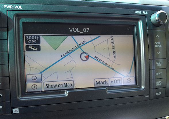
The four personality types on the spectrum of design; VOL_07

Tech, UI / UX 1 Comment »

vol_07

I was looking at the car display in my wife’s new Toyota and had a double take when I changed the volume. The display literally reads “VOL_##”. Who would ship that? Even more baffling was the fact that my own older car of the same make doesn’t have this ugly format at all. Surely this was the result of some i18n(”VOL_07″) and the mapping to “Volume 07″ was missing?

This started to remind me of the sliding scale of design and fashion awareness that I see out there. Here are some stereotypes:

Fashion Deaf

Have you met those people who couldn’t care less about fashion? Well, not even that…. they can’t even see the difference in quality. You give them two pieces of clothing, or two user experiences, and they have no preference what-so-ever. These people have no idea why some folk much prefer Mac. They would never notice or care about VOL_07 and more power to them.

The A/B Eye Test

Next up you have the folks who can tell that something is “better”. They love their iPhones, although they can’t really tell you why. If you put two UIs in front of them they will tell you that they prefer A over B, but can’t *really* articulate why. They get it at an unconscious level.

My eyes! my eyes!

Then you have the folks who are personally pained by unfashionablistas. VOL_07 and Android UIs make their eyes bleed. They think that Google needs to hire some designers for many of their products.

When given the A/B test, they are able to discern what they like and dislike about a given design, and they come up with things to improve. They get it.

The Creator

Then there are the folks who can go to the next level. They can create great design. It can look good in the current fashion, or the best ones are able to make the future. They come up with new amazing interactions and visuals. They make you love their product.

Now, of course these are gross generalizations. I can jump around a little between these categories even depending on my mood that day. I can amaze myself coming up with something decent one day, and then be staring at crap another. Kinda like my golf game…. you hit enough good balls that you are willing to come back some time to play again.

I really enjoy watching folks in the top two categories. Ben is one of those guys. I can stare at the same thing as him and he will find 20 holes in it that I do not. Watching a creator such as Sean Martell wielding his Wacom tablet is a sight to beyond. Watching greatness at work.

Where do you fit?

Sep 23

Why install time permissions suck. Why we wanted access to contacts in the Walmart app

Tech, UI / UX, Walmart with tags: 5 Comments »

I have always disliked install time permissions. The user is asked to make a decision up front that:

  • They don’t have any context around
  • They can easily forget
  • They often say “yes” just because they wanted to download the darn thing
  • There is no way to tweak the permissions

addressfromcontacts

This reared its head today. We released a new version of the Walmart Android app. In there we are trying to make the user do as little typing as possible, so when you create a new address there is an option at the top to grab the address from your contacts. There is a good chance that you are sending the goods either to yourself (home, business) or to a friend / family member…. and you may have that info already available.

The problem is, that for us to get that information, we need to blanket ask every user for that access on install. Many users are privacy conscious and I respect that. They should be able to say “thanks, but I don’t want you to have access to my contacts”. We are using a contact picker UI, so the user is explicitly tapping to launch this and selecting the contact, so we don’t need access to anything other than what the user would select. Why do we need READ_CONTACTS?

Why can’t I let those users NOT allow the application access to contacts, but still be able to do everything else? The zero-sum game is nuts.

This shows up all over the shop. If I have an application that happens to have one screen that would be able to help the user by accessing the Geolocation API…. I have to ask for that up front. That screen may be used 0.0000001% of the time, and it just may be aided by that (not required to function).

We need to fix permissions. Would it be so hard to let us say “these permissions are nice to have and can even be on demand” so users can check or uncheck permission there? (this has happened to others too, and we should have realized it would be an issue, so that side of things is our bad :/)

For our users who were scared off when they saw the request for that permission, I am very sorry. We are looking to setup a new build that doesn’t require it at the expense of the convenience feature.

On another note, I am super jazzed at the hard work that went into this release. This app has a bunch of native and Web integration. Our Android and mobile Web teams have worked together to great affect, and although this is just the very tip of the iceberg, it has been great to see!

Remember, if you want to do Android, iOS, or bleeding edge mobile Web development that reaches millions of users globally, please let me know. Join us, the water is warm!

Aug 03

Bad Email UI

Apple, Tech, UI / UX 2 Comments »

It is so easy to nitpick on UI…. but this one gets to me everytime, and doubly so that it comes from Apple (known for user experience).

Season Pass Email

There are two links in the email. One is at the top, and the other is after the header showing the name of the show. The one next to the show sends you to preferences rather than downloading the darn thing! Both are “click here”.

How about a big link/button: “Download your show now”.

Is this just me?

Jul 26

Lion wimpers on Spaces

Apple, Tech, UI / UX No Comments »

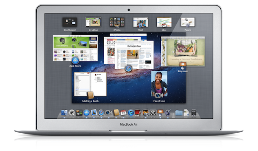
overview_osx_lion

There have been a slew of posts on Lion since launch. As with any new change of experience, there are bound to be detractors as well as well wishers. Just look at the new Facebook groups that jump to light whenever Facebook changes a pixel on the screen.

Lion has been somewhat buggy for me, and slower than its leaner leopard friend. The “natural” scrolling was a pain for a few minutes, but a couple of days in and your brain flips. In fact, even when I hit the up and down keys my mind considers them working on the paper as opposed to the scroll bar (and thus it goes the wrong way).

Sometimes one step forward can be one step behind. I just witnessed this over the weekend when voice mail was installed on the land line at my families cabin in Colorado. Before-hand, we had an old digital answering machine system. How archaic! As we setup voicemail we consider the improvements:

  • “Now we can check this from anywhere!”
  • “If the phone line isn’t working, voice mail can still be left by the caller!”

However, you then realize that you lose benefits:

  • “How do we see if someone has left a call?” Before-hand you could glance at the phone to see if there are new messages. We would need to purchase something that could do that for us now. Instead, you have to pick up the phone and listen for the tell tale voice mail beep.
  • “How can I screen a call?” Before-hand if someone called and you didn’t know / didn’t want to pick up right away… you could listen to them leaving the message and even jump in to pick it up mid way

This feeling of “step forward or step back?” is how I feel about the whole mission control / spaces overhaul. I really enjoy putting some apps full screen. However, that breaks my workflow. You see, I have a series of spaces that are configured for different use cases. I access them via Apple-1, Apple-2, etc. If Apple-2 has been my “calendar” space, I could wish to instead have a full screen calendar in that place. Unfortunately, as soon as you full screen an application it lives in its own space, and one that you can’t directly access via a quick key like that. So, I am now forced to keep Calendar out of full screen mode, and it becomes a tease.

When plugged into a monitor, I am further teased with full screen. It doesn’t take into account anything more than the one main screen. I can no longer have my email full screen on the main screen with my calendar staring at my from my laptop screen.

Ah shucks. I look forward to a world where I can neatly configure my various use cases (if plugged in, keep X, Y, and Z over on my secondary screen, else put them on these spaces).

Although we hear more about the visual changes within Lion, it appears that the under the hood changes are really the most important (security sandboxes, versions, etc).

Jun 20

iOS as the perfect projector? More fun mobile design thinking

Mobile, Tech, UI / UX 1 Comment »

projector

I have to say it, I love AirPlay. Being able to use any device (phone, tablet, laptop) to project something to your lovely flat screen is fantastic. Up until now, the focus has been on media (which makes sense) and being able to send anything from a funny YouTube clip, to a movie you have purchased on iTunes, if solid.

But, with an improved AirPlay, the app developer can project whatever they want onto an AirPlay aware screen (or just audio for non-screen output). This has entered my mind into its latest “woooah, how cool would it be if [insert app here] used that feature to project [insert cool idea here]!”

The obvious ideas that people talk about first is gaming. iOS is already a force in gaming, but now that your devices are controllers and can teleport their views to a screen at a whim? Wow. I can’t wait to see the game that personifies having iPhone and iPad form factor controllers and helpers.

There is much beyond media and the games though. TV’s now come as weak app platforms. I have got a Twitter app on my Samsung. It sucks. I never use it. It is also not needed. I should be able to sit down with the Twitter iPad app open on my lap, and display tweetigoodness to my TV. I could have a simple view, but also, isn’t the TV a perfect TweetDeck?

As well as having the iPad as a controller but using the TV as the main display, you can also go with different modes. As you work on an image, you can see throwaways, or old versions, up on the TV for you to look at. The Echofon Twitter client has a Photofon app that shows you images from your Twitter stream, but that could be embedded and a screensaver kicks in.

Now you have these lenses on, I dare you to open up an app and not think about a cool visualization for another screen!

I hope that PhoneGap has a plugin in the works for this in their iOS 5 support (ASIDE: A birdy may or may not have told me that full screen WebViews run with the JIT which is good too) so Web folk can take care of this too. It would be fantastic to have Web views available to project over there.

There is still so much that will be coming too: More TV’s will be AirPlay enabled (so you won’t need an Apple TV); Other operating systems will start to support these modalities (read: industry standard AirPlay please :/); The browser is an ideal projector too, and cross platform; And, then the other screens will also start to accept touch input.

So, I now have another question to ask when I start a new mobile project…. to go with others such as:

  • What goodies can I hide in the scroll over space?
  • What could we put in landscape view here?
  • (hardware keyboard) What shortcut keys could we use, and what action can we type first to
Mar 07

The balance of UI elegance; Learning from the Dickbar

Tech, UI / UX 2 Comments »

The iOS Twitterati came out in full force once once they had upgraded to the latest 3.3 version. The new version has a ton of great features, such as autocompletion of @usernames and hashtags, better photo uploading, and some UI cleanup. This has all been over shadowed by the addition of a “trending topics” bar that appears at the top of your view.

I am sure that some users love the feature (the quiet ones) but a vocal community quickly came about and:

  • a) complained
  • b) reverted to 3.2 or even to try other clients (e.g. Echofon)
  • c) built and installed software to “fix” the issue (e.g. Twizzler).

Those who are vocal wanted a way to turn this off. An option. Even if it is buried in the settings (a few taps into the app).

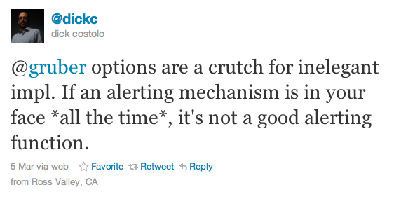
To this, Dick Costello (CEO) responded:

dickcquote

This is very interesting, and where we can learn. I have found that one key art in software development is when and how to abstract your code. I have seen developers go down a common path:

  • Phase 1) Minimal abstractions. Spaghetti code ensues. Everything is coupled to everything else
  • Phase 2) Crazy abstractions. Ravioli code ensures. Everything is wrapped as one method with an abstract class and an Interface (picking on Java here!)
  • Phase 3) The balance. Working hard to make the right balance, enabling readable and modular code without losing the ability to see how it all fits together.

ASIDE: I tend to enjoy the like of Ruby (and even JavaScript and CoffeeScript) as I always feel like every line of code is doing something.

There is a similar balance in the world of UX. You want to offer just enough knobs and switches to get people working in a beautiful way, but not too many (so they can’t work out how to do a darn thing [e.g. original desktop linux days]) or too few (so they feel like they can’t get anything done!).

I find it fascinating to watch this balance. As a power user, I find it interesting to know what I personally want to be able to tweak about a system. For example, going back to Twitter. I switched to Echofon from Tweetie back in the day. I loved much about it:

  • The way that you click on something and a gutter shows you more, but you don’t lose your context
  • It was an early consumer of the streaming API so data showed up sharply
  • It showed when people interacted with my tweets (other RT, favorites, etc).

One feature that people will scoff at as minor, is the fact that it has no way to display the real name of the tweet author, and instead I am stuck with a username. Now, I happen to have a bunch of folk who I follow who have fun handles. However, I don’t have the full mental map to remember that @monkeyape23 is my old mate Bob from England. I just want to see his name. Please. This silly little feature lead me away from Echofon believe it or not (please add it guys!).

I liken my Twitter client to my Email client. Some people love their stock Gmail/Mail.app/Outlook experience, but many very much like to tweak it. Some may want a three-pane view (I use “Multiple inboxes” on Gmail for this), some want to change the number of lines in the preview, and others trick the hell out of their system with scripts and extensions. You are in this software daily, and some folks like to sharpen their tools.

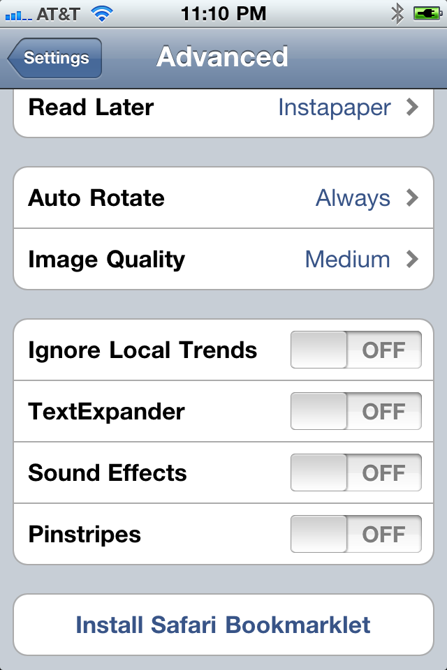
pinstripes

Now, I get that the official Twitter client is a “base level experience”, but that doesn’t mean it has to be simplistic and rigid. I also find it hilarious that, although there isn’t an option to hide the Trendbar, there IS an option to turn pinstripes on and off :)

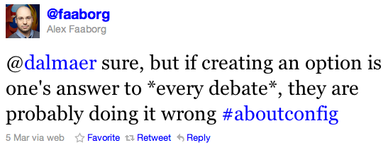
You can easily go too far with “options” as Alex Faaborg (Firefox UX…. highly respected) mentions:

Screen shot 2011-03-07 at Mar 7 @ 12.48.24 AM

Now, I mentioned extensions above. This is another important thing to think about as a release valve for your users. Firefox took something that “had too many options” (Mozilla Suite) and stripped it to something much more bare bones, but XUL/XPCOM were still there (and even about:config was good in that extensions could target it). Developers could create fantastic additional experiences that users could enjoy. To me, this was one of the key items of Firefox that made it #winning in the old days. IE actually had add-ons too, but they were painful to write and the platform was nowhere near as approachable and available. We got amazing functionality such as Firebug and Greasemonkey.

Ah, Greasemonkey! The Web turns out to be a fantastic extension platform. When I load up twitter.com itself, a few Greasemonkey scripts kick in for me to customize the experience, and I get things how I want them. You can mine for great user scripts out there, and now that browser such as Safari and Chrome also not only offer extension support, but do so in a very HTML (and Greasemonkey) friendly way, you will find them packaged there too. Chrome and Safari had to create extension systems to compete. How many of you waited for that one extension to full switch from Firefox to Chrome?

In my ideal world, Twitter would not only add an option to get rid of the #dickbar, but would also offer an extension API that would enable folks to build extensions that flow from their awesome communication ESB in the cloud, all the way to the client platforms that access it.

Our users are human and have different needs. It is fine and dandy to want to “do a Steve Jobs” and create something that is so perfect that you can hand it down to the fellows, but how about a one-two punch. A fantastic default experience, with hooks to enable developers to offer up fantastic experiences to your end users.

I couldn’t move to Chrome without Adblock and ….

I can’t move to Sparrow until Rapportive is supported.

If you create a great plugin system, there will be no reason not to move on. #thewebrocksatthat #firstworldproblems

Dec 02

Native apps are always better than Web apps; Psst, the new way has an escape chute

HTML, JavaScript, Mobile, Open Web, Tech, UI / UX, iPhone 3 Comments »

When we talk about the mobile Web being a good candidate to be a unifying platform for mobile and beyond, we often get nay-sayers telling us that there is no chance of this happening.

Their claims often chanted include:

  • Cross platform never works (case in point: Swing)
  • You can’t create a great experience without going native (and Apple raised the bar on the experience!)

There is some validity to some of this, but I also wanted to discuss the other side too.

Cross Platform Did Work

Swing gets bashed because a) it didn’t take off, and b) people always saw Swing apps as ugly and great examples of the uncanny valley. That team worked tirelessly for many years to try to get the look and feels to be as exacting to their hosts as possible. A pixel off here and there…. and it felt wrong.

It turns out that this probably wasn’t the right approach, and either a) Use SWT to use the real OS components or b) create a great looking l&f that is different to any one host, but natural and fantastic to use. Ben, Jasper Potts, and others fought for such a look and feel in Nimbus but a lot of time had gone by.

We have all seen many platforms on top of hosts that don’t feel right and don’t look good. That doesn’t mean that cross platform can’t work. Flash is an example that is very much cross platform and that community very much went the “every app will have its own UI”…. probably TOO far in the other direction ;)

In fact, the Web itself is a fantastic cross platform success. We have argued that if it wasn’t for the massive Web revolution, would non-Microsoft vendors (read: Mac OS X) be in the situation there are now? Or would they have followed in the wake of Atari, Amiga and BeOS? When the Web happened, suddenly the interesting actions that people wanted to do on a computer were dominated by the global scale of the Web (Google, Amazon, Yahoo!, eBay, etc). The Microsoft Office lock-in was gone (aside: it also DID help a lot that Microsoft gave Apple money, got Office over there, and solutions like VMWare enabled those few Windows apps that you still wanted to come with you).

The Web was a great cross platform success, even though its rich capabilities in the areas of graphics were laughable…. as I mentioned in an earlier post:
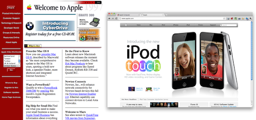
Apple - old and new

When you look back at many of the earlier designs of the top website brands, they are comical by todays standards. However, at this same time, technology such as WPF was being touted on the desktop. Why would people visit Web sites when they could experience amazing native Windows and Macintosh experiences?

So, I don’t think you can discount the Web on the merits of “cross platform can’t win” as it already did win once, and at a time when the capability gap was much wider than we now have with HTML5.

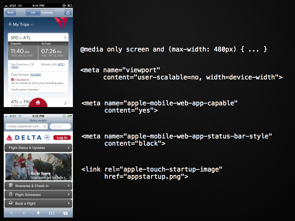
Compare this native app to their Web site!
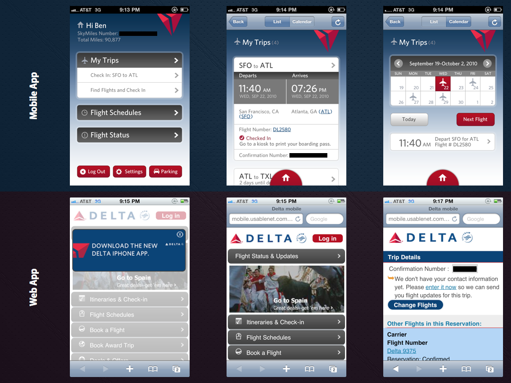
delta-casestudy1

I teased about the Delta mobile Web application before. If you compare their iPhone application to what you get if you go through a mobile browser, the difference is huge.

But, is the reason they are so different due to capability? I think not. I think the reason is much more about structure, legacy, politics, and history reasons.

I remember seeing an early viewing of an Adobe AIR eBay client. The thing was so rich, so much better than the awful eBay site in almost every way. It made you want to cry looking at the website afterwards. Why or why would eBay have this fantastic client and not spend time on the website where all their customers were! It wasn’t that they were baffoons, it was because they had no legacy in this new world!

The designers had free rein with a blank sheet of paper. They had core concepts and some design language, but total creative freedom. Compare that to the website. If they changed the color one hex value users would go nuts! Every time Facebook changes their site there is a massive campaign to change it back for the first 2 weeks.

They also didn’t have to run the gauntlet of the massive codebase that had been built over years to make any of these changes. And the QA. Ugh.

In fact, an entirely new team could be formed to do this work.

This is exactly what I am seeing in mobile. In many companies, if there is a mobile group, they are just that…. a very separate group. In a non-mobile-thinking company they are like the old “Mac” group in a Windows heavy shop that hangs in the corner and is very different.

Other companies are still getting into the world of mobile and realizing that usage patterns are going in that direction. They are bringing in consultants to help out. They are forming new crack teams to take on the challenge. They are realizing that they need to re-think the entire experience, and hopefully realizing that they need to create software as-a-whole in a very different manner.

The bar on the quality of experiences on some of the mobile platforms is very high indeed (and very low on others!) which has the (great) effect of pushing the bar forward.

Will this leave the Web versions behind? Maybe in the short term. Kinda like how the old Twitter website was simple compared to Tweetie and other clients, but #newtwitter is much richer and borrows some of the concepts where they make sense.

I am definitely seeing people swing back to their web experiences. As multiple platforms foster in touch and cross device, they are starting to feel the increasing tax of building totally different applications across the fragmentation, and then trying to keep them in sync once the 1.0 is complete. Outsourcing the 1.0 is one thing, but the syncing part is hard.

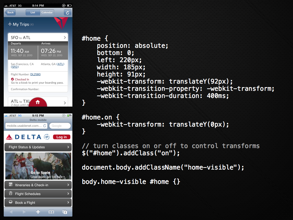
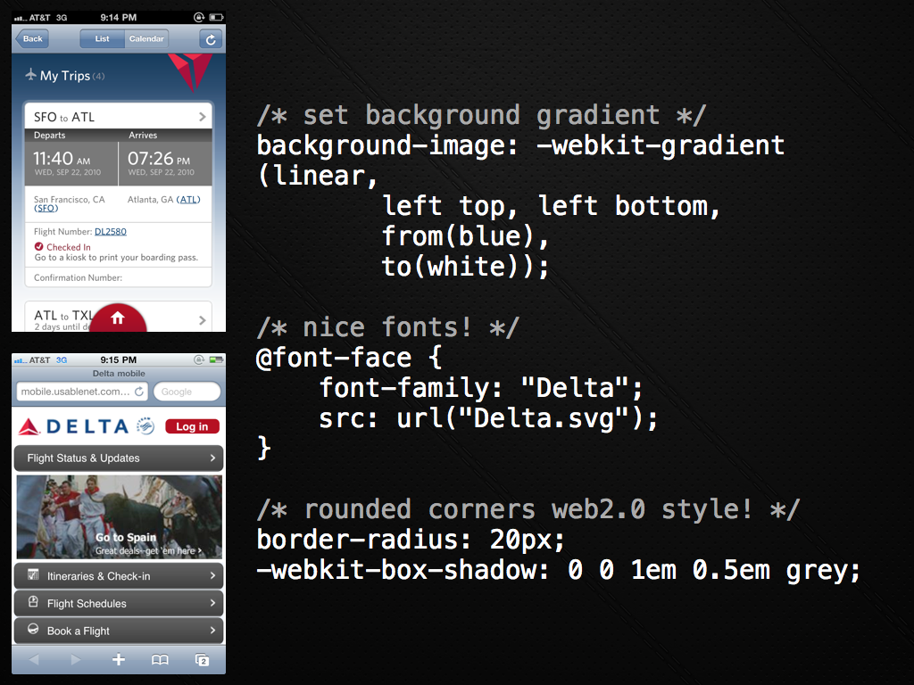
Back to Delta. You will notice that the screenshots on the web side get increasingly poor as you go deeper into the experience. Contrast that with the iPhone version above that is always at a high quality. It is time for them to go back to the web side and sync up.

In fact, just before a recent talk, we coded up some of the simple transitions and feel just so show how easy it is to get some of this stuff working via the mobile Web. You can see the simple example here.

In our Palm Developer Day keynote we shared some of the high level pieces on how to put this all together, the major piece being that you have to really re-think the way that you architect your applications (think: Gmail not server generated HTML, Backbone.js, and more).

Here are some of the slides:
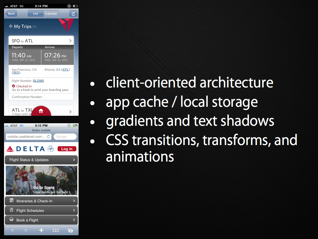
delta-casestudy2

delta-casestudy3

delta-casestudy4

delta-casestudy5

aside: Dave Balmer goes into some depth in his Rockstar apps with HTML5 talks.

Of course, it isn’t all hunky dory. There are still edge cases on getting things performing just right using the Web on the various devices. You have to think “cross platform” again. It may have been nice to ignore that and hack on a native application for awhile. But, would you rather be porting between proprietary SDKs and languages all day long? Or re-use as much of your code as possible.

And, if for some valid reason you really DO need a bit of native for something, you can break out of jail and do just that. The escape chute is waiting for you.

We have a long way to go on giving developers better access to native capabilities and tools to make building the next generation of apps more of a breeze, but it is doable right now (another aside: webOS kinda proves that right now as the native apps ARE Web apps!)

I will finish with the interesting take from Venture Beat the other day on how
the iPhone app is the Flash homepage of 2010. They say:

In the late 1990s, it was common for companies to spend $50,000 to $150,000 for a Flash homepage that looked like a beautiful brochure. However, they soon learned that Flash was cumbersome, slow to load, expensive to build, and hard to update, and moved on to HTML. Now only specialized, high-end sites are Flash only.
The exact same thing has replayed itself on the iPhone. Companies have paid $50,000, $100,000, and more for an iPhone app. Now they have to keep the iPhone app in sync with their regular web site, and have to add additional native apps, each at a high price point, due to the hypergrowth of Android and newly viable platforms like Windows Phone 7