The iOS Twitterati came out in full force once once they had upgraded to the latest 3.3 version. The new version has a ton of great features, such as autocompletion of @usernames and hashtags, better photo uploading, and some UI cleanup. This has all been over shadowed by the addition of a “trending topics” bar that appears at the top of your view.
I am sure that some users love the feature (the quiet ones) but a vocal community quickly came about and:
- a) complained
- b) reverted to 3.2 or even to try other clients (e.g. Echofon)
- c) built and installed software to “fix” the issue (e.g. Twizzler).
Those who are vocal wanted a way to turn this off. An option. Even if it is buried in the settings (a few taps into the app).
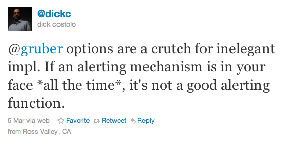
To this, Dick Costello (CEO) responded:
This is very interesting, and where we can learn. I have found that one key art in software development is when and how to abstract your code. I have seen developers go down a common path:
- Phase 1) Minimal abstractions. Spaghetti code ensues. Everything is coupled to everything else
- Phase 2) Crazy abstractions. Ravioli code ensures. Everything is wrapped as one method with an abstract class and an Interface (picking on Java here!)
- Phase 3) The balance. Working hard to make the right balance, enabling readable and modular code without losing the ability to see how it all fits together.
ASIDE: I tend to enjoy the like of Ruby (and even JavaScript and CoffeeScript) as I always feel like every line of code is doing something.
There is a similar balance in the world of UX. You want to offer just enough knobs and switches to get people working in a beautiful way, but not too many (so they can’t work out how to do a darn thing [e.g. original desktop linux days]) or too few (so they feel like they can’t get anything done!).
I find it fascinating to watch this balance. As a power user, I find it interesting to know what I personally want to be able to tweak about a system. For example, going back to Twitter. I switched to Echofon from Tweetie back in the day. I loved much about it:
- The way that you click on something and a gutter shows you more, but you don’t lose your context
- It was an early consumer of the streaming API so data showed up sharply
- It showed when people interacted with my tweets (other RT, favorites, etc).
One feature that people will scoff at as minor, is the fact that it has no way to display the real name of the tweet author, and instead I am stuck with a username. Now, I happen to have a bunch of folk who I follow who have fun handles. However, I don’t have the full mental map to remember that @monkeyape23 is my old mate Bob from England. I just want to see his name. Please. This silly little feature lead me away from Echofon believe it or not (please add it guys!).
I liken my Twitter client to my Email client. Some people love their stock Gmail/Mail.app/Outlook experience, but many very much like to tweak it. Some may want a three-pane view (I use “Multiple inboxes” on Gmail for this), some want to change the number of lines in the preview, and others trick the hell out of their system with scripts and extensions. You are in this software daily, and some folks like to sharpen their tools.

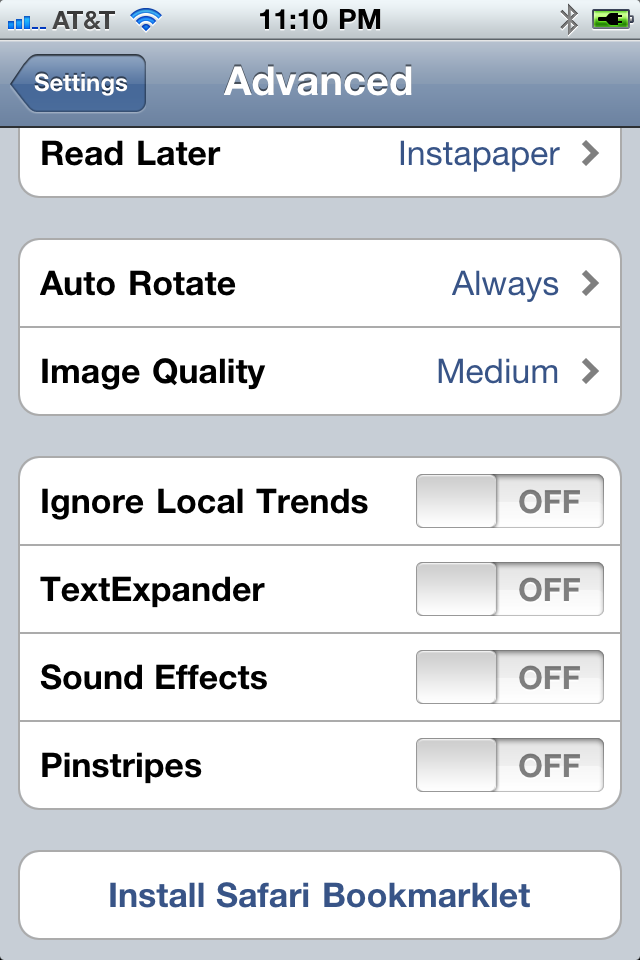
Now, I get that the official Twitter client is a “base level experience”, but that doesn’t mean it has to be simplistic and rigid. I also find it hilarious that, although there isn’t an option to hide the Trendbar, there IS an option to turn pinstripes on and off :)
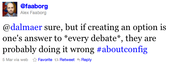
You can easily go too far with “options” as Alex Faaborg (Firefox UX…. highly respected) mentions:
Now, I mentioned extensions above. This is another important thing to think about as a release valve for your users. Firefox took something that “had too many options” (Mozilla Suite) and stripped it to something much more bare bones, but XUL/XPCOM were still there (and even about:config was good in that extensions could target it). Developers could create fantastic additional experiences that users could enjoy. To me, this was one of the key items of Firefox that made it #winning in the old days. IE actually had add-ons too, but they were painful to write and the platform was nowhere near as approachable and available. We got amazing functionality such as Firebug and Greasemonkey.
Ah, Greasemonkey! The Web turns out to be a fantastic extension platform. When I load up twitter.com itself, a few Greasemonkey scripts kick in for me to customize the experience, and I get things how I want them. You can mine for great user scripts out there, and now that browser such as Safari and Chrome also not only offer extension support, but do so in a very HTML (and Greasemonkey) friendly way, you will find them packaged there too. Chrome and Safari had to create extension systems to compete. How many of you waited for that one extension to full switch from Firefox to Chrome?
In my ideal world, Twitter would not only add an option to get rid of the #dickbar, but would also offer an extension API that would enable folks to build extensions that flow from their awesome communication ESB in the cloud, all the way to the client platforms that access it.
Our users are human and have different needs. It is fine and dandy to want to “do a Steve Jobs” and create something that is so perfect that you can hand it down to the fellows, but how about a one-two punch. A fantastic default experience, with hooks to enable developers to offer up fantastic experiences to your end users.
I couldn’t move to Chrome without Adblock and ….
I can’t move to Sparrow until Rapportive is supported.
If you create a great plugin system, there will be no reason not to move on. #thewebrocksatthat #firstworldproblems


March 7th, 2011 at 10:31 am
Wouldn’t a plugin mechanism in the iOS client violate Apple’s terms against downloadable and runnable code modules?
March 9th, 2011 at 11:35 am
I’m meeting Sparrow this week, let’s see what happens… :)