Google Plus. In a world of Facebook, Twitter, Path…. Google Plus is yet another option that sits in between Twitter and Facebook for me. It has great technology (would love to have more than 140 characters on Twitter and decent comments etc) and features (e.g. hangouts).
But, for now I don’t use it much. Having it integrate into Google properties is fantastic if you are a Google+ user, but as someone who isn’t it drives me nuts.
It would be one thing if space was taken up in subtle ways, but what has really started to drive me nuts is the “look I’m here!!!!” approach in the UI.

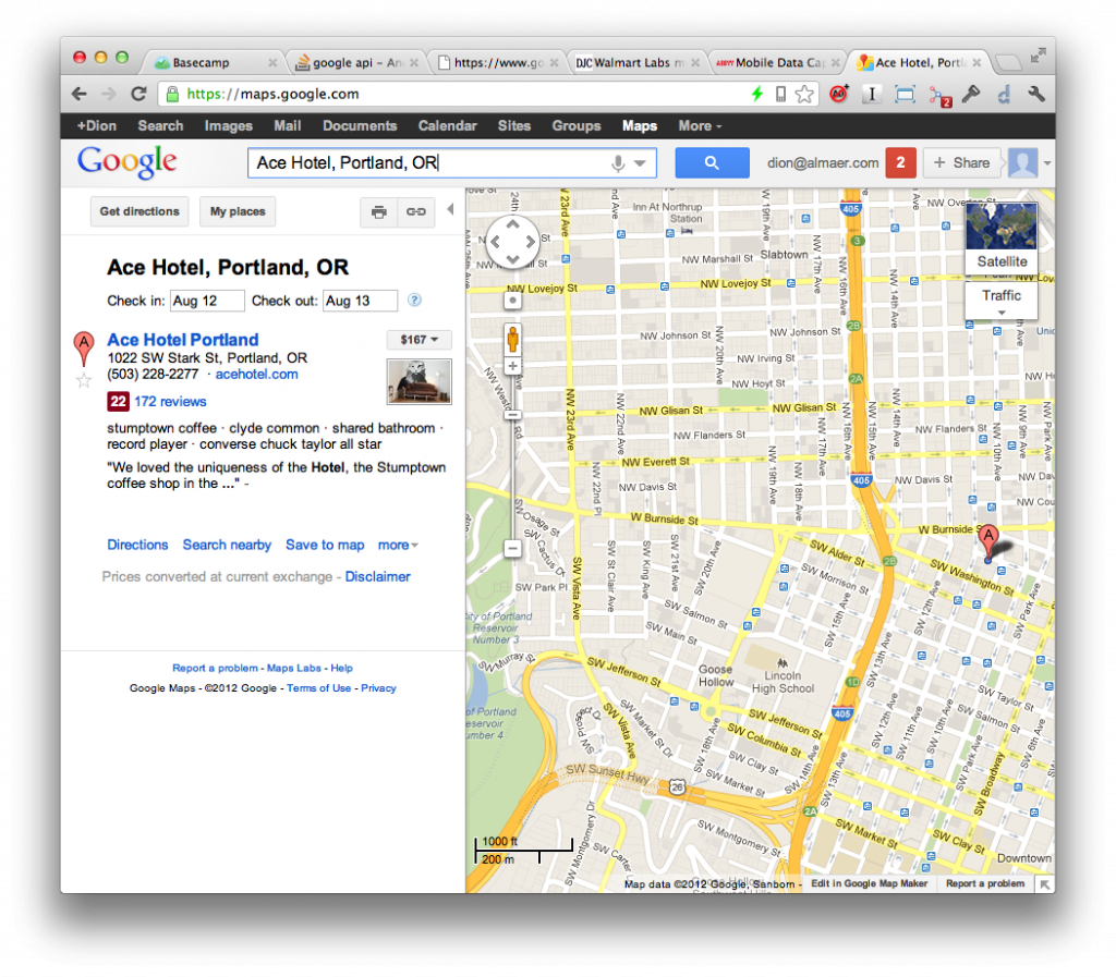
When in a property such as search or maps, there is a red notifications square that shows up. Not only does it appear there, but it animates its way into your life. It is subtly distracting in a way that makes you look over there… which is what you would A/B test for if the info was important, but I came here to see the map!
The Web doesn’t tend to have much animation and transition going on in UI (although this is changing) compared to iOS, Android, and Flash. You can use it as a powerful force to alert the user to something you really want them to see.

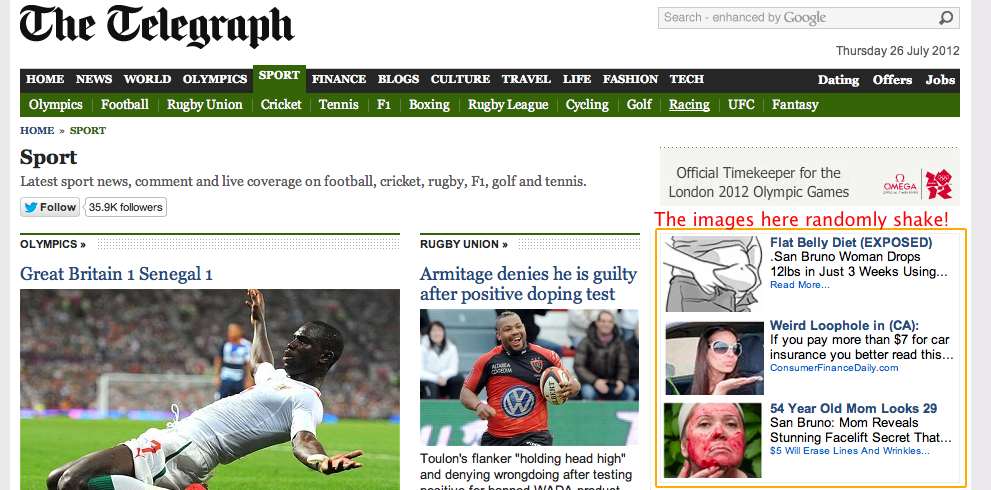
I saw an even more annoying usage. The Telegraph newspaper has the images in its ads seemingly randomly shift around. I can only assume this is to again draw your eye over there and it is incredibly annoying.
Stop it!
Use your powers for good.
