Creating custom scrollbars with CSS; How CSS isn’t great for every task
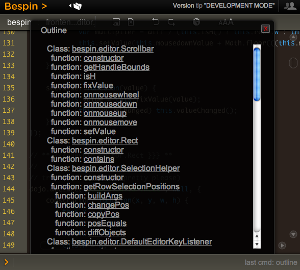
Have you tried to create a nice rich experience and then been fighting the “defaults” to go the extra mile? This reared its head with me recently with Bespin. There are certain commands that pull up divs of content and we need to scroll through it. The problem is that the native scroll bar looks so out of place:

WebKit recently released the ability to style scrollbars in HTML elements (but not the main window, which you have been able to do in IE for donkeys years much to many peoples chagrin).
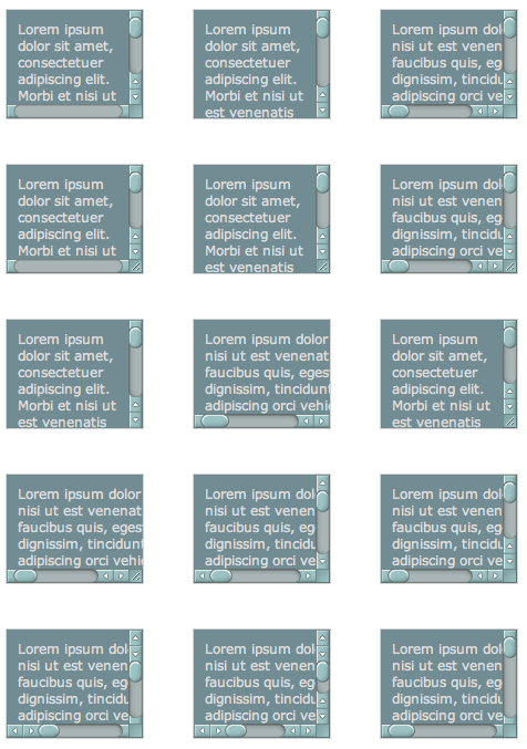
I decided to take it for a spin and loaded up the examples that show you being able to do every type of scrollbar that you can imagine:

So, it shouldn’t be so hard should it. From the blog post I see a few magically ::-webkit-scrollbar CSS properties that I can plugin and be on my way. But looking at the example view source you see many pieces like this:
:not(.none):not(.double-start)::-webkit-scrollbar-track-piece:vertical:end:single-button,
:not(.none):not(.double-start)::-webkit-scrollbar-track-piece:vertical:end:double-button,
.single::-webkit-scrollbar-track-piece:vertical:end,
.double-end::-webkit-scrollbar-track-piece:vertical:end,
.double-both::-webkit-scrollbar-track-piece:vertical:end {
    margin-bottom: -6px;
}
Holy pseudo classes batman! To be fair, this is partly due to the example page having many types of scrollbars in one (hence the not this and not that but the other) but there are still nested classes that you need to grok to get this going.
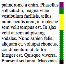
I quickly built a debug scrollbar where I styled the various pieces with simple colors and borders so I can see which was which. I also went about making the scrollbar have one up arrow on top, and one down arrow on the bottom.

The parts and pieces of a scrollbar are quite simple:
- Thumb: This is the piece that shows you where you are in the scrollbar. This is the chap that you can move around
- Track: This is the area of the scrollbar that you can move the thumb up and down, or along (depending on the orientation). There is both the area between the top and the thumb, and between the bottom of the thumb and the bottom of the scrollbar
- Buttons: There may be buttons that you can click to increment or decrement the selection (which moves the thumb). There are various styles (single button, double button, etc)
- Resizer: This can change the are of the element (e.g. enlarge of shrink)
- Corner: This area may show up with both horizontal and vertical scrollbars open
The debug scrollbar kinda shows these areas off in a simple visual way. Note how using display: block|none enabled me to setup the single button on top and bottom functionality:
/* Turn on a 13x13 scrollbar */
::-webkit-scrollbar {
    width: 13px;
    height: 13px;
}

::-webkit-scrollbar-button:vertical {
    background-color: red;
    border: 1px dashed blue;
}

/* Turn on single button up on top, and down on bottom */
::-webkit-scrollbar-button:start:decrement,
::-webkit-scrollbar-button:end:increment {
    display: block;
}

/* Turn off the down area up on top, and up area on bottom */
::-webkit-scrollbar-button:vertical:start:increment,
::-webkit-scrollbar-button:vertical:end:decrement {
    display: none;
}

/* Place The scroll down button at the bottom */
::-webkit-scrollbar-button:vertical:increment {
    background-color: black;
    border: 1px dashed blue;
}

/* Place The scroll up button at the up */
::-webkit-scrollbar-button:vertical:decrement {
    background-color: purple;
    border: 1px dashed blue;
}

::-webkit-scrollbar-track:vertical {
    background-color: blue;
    border: 1px dashed pink;
}

/* Top area above thumb and below up button */
::-webkit-scrollbar-track-piece:vertical:start {
    border: 1px solid #000;
}

/* Bottom area below thumb and down button */
::-webkit-scrollbar-track-piece:vertical:end {
    border: 1px dashed pink;
}

/* Track below and above */
::-webkit-scrollbar-track-piece {
    background-color: green;
}

/* The thumb itself */
::-webkit-scrollbar-thumb:vertical {
    height: 50px;
    background-color: yellow;
}

/* Corner */
::-webkit-scrollbar-corner:vertical {
    background-color: black;
}

/* Resizer */
::-webkit-scrollbar-resizer:vertical {
    background-color: gray;
}
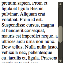
By moving the scrollbar around I could quickly see how this all worked, and it got me to this point which enabled me to plugin the images to make this puppy work for Bespin:

There were a couple of key tweaks needed to make this work:
Getting the buttons working
I used the same trick used in the debug example to turn on the up area above, and the down area below, and then it was just a matter of targeting the correct area for the arrow images:
/* Turn on single button up on top, and down on bottom */
::-webkit-scrollbar-button:start:decrement,
::-webkit-scrollbar-button:end:increment {
    display: block;
}

/* Turn off the down area up on top, and up area on bottom */
::-webkit-scrollbar-button:start:increment,
::-webkit-scrollbar-button:end:decrement {
    display: none;
}

/* Place The scroll down button at the bottom */
::-webkit-scrollbar-button:end:increment {
    background-image: url(images/scroll_cntrl_dwn.png);
}

/* Place The scroll up button at the up */
::-webkit-scrollbar-button:start:decrement {
    background-image: url(images/scroll_cntrl_up.png);
}
Get the track pieces to show
Next up was getting the gutter to show up. As mentioned early on, there is one track, but two areas that can show…. before the thumb and after. You can target these areas via -webkit-scrollbar-track-piece:start || :end and then it is a matter of using the multiple background ability available in new browsers. First we have the top of the gutter, and then a recurring background (and the same for the bottom). This way it just grows with the area that it gets:
/* Top area above thumb and below up button */
::-webkit-scrollbar-track-piece:vertical:start {
    background-image: url(images/scroll_gutter_top.png), url(images/scroll_gutter_mid.png);
    background-repeat: no-repeat, repeat-y;
}

/* Bottom area below thumb and down button */
::-webkit-scrollbar-track-piece:vertical:end {
    background-image: url(images/scroll_gutter_btm.png), url(images/scroll_gutter_mid.png);
    background-repeat: no-repeat, repeat-y;
    background-position: bottom left, 0 0;
}
The Thumb
To get the thumb working, I thought I would do the same background image trick with three images (top of thumb, bottom of thumb, and background for the middle). Unfortunately this didn’t seem to work for me as I couldn’t get the middle to not go through the top and bottom. So, instead, I went with another new CSS trick: border-image. Here I splice the top and bottom of a thumb (the top and bottom 8 pixels) and stretch the rest:
/* The thumb itself */
::-webkit-scrollbar-thumb:vertical {
    height: 56px;
    -webkit-border-image: url(images/scroll_thumb.png) 8 0 8 0 stretch stretch;
    border-width: 8 0 8 0;
}
John Resig has a nice readable post on border-image.
And, there you have it. Now we can have nice Bespin-y scrollbars throughout Bespin. This may not be complete though, as we have the ability to also tie in :active and :hover work if we wish (change the color when selecting etc).
Of course, many people had “custom scrollbars”. There are plenty of comments on the original Surfin’ Safari post, and various rants about Flash versions. I agree that we have all seen bizarre Flash versions of scrollbars that don’t look like them at all, and where the designer didn’t bother to put in support for the mousescroll ability etc, but this is a bit different. It let’s you merge in your look and feel, yet with native scrollbar functionality.
And, with Google recreating the button maybe we can feel a little bit better about tweaking the look of common UI elements as long as they are familiar enough to users to still make natural sense.
Now, the CSS declarative way to do scrollbars seems to get pretty ugly to me with all of he pseudo classes and various magic to get the functionality that you would like. I have to admit to liking Kevin’s demo of Flash Catalyst at Web 2.0 Expo and how it lets designers build out a scrollbar. We should be inspired to do tools like this. What if we had an API that wasn’t CSS, but let us say: “I want a Mac style double on the bottom button scrollbar. And, here is a thumb, here is a track, go for it”.
That being said, at least we do have the ability to do this kind of thing now. I hope that other browsers follow WebKit in this instance.

April 6th, 2009 at 10:12 am
Personally I find Google’s reskinned buttons annoying. Firefox goes out of its way to render buttons the way your OS intends, and they throw all that away? Similarly, I don’t personally like reskinned scrollbars.
April 6th, 2009 at 10:27 am
Ted,
This is what user styles are for? I like having the developer able to do what he feels is best, and then having the user, who knows best how HE feels, to be able to override anything.
Cheers,
Dion
April 6th, 2009 at 10:44 am
I can see how custom scrollbars are a controversial topic, but I think they’re well worth it. Browser default bars are extremely intrusive, especially when used with overflow:auto for web apps. I often end up resorting to a jQuery plugin. For instance, see this page recently completed: http://www.upenn.edu/curf/fellowships/fellowships-directory – The overflow section helps simplify the page design, by providing a scrollable list, but a default scroll bar would have totally interrupted the page flow.
PS. Dion, lovely style for Bespin, there. Will have to get something like that on WebKitBits…
April 6th, 2009 at 12:10 pm
With the right amount of squeezing you’d probably be able to get those images in there as data uri’s ;-)
April 7th, 2009 at 1:37 pm
@David,
I agree!
@Jaap,
Ohhhhh very cool idea :)
May 1st, 2009 at 8:44 am
Any chance of an ‘after’ screenshot that shows the same view you showed at the beginning of the article but with the new themed scrollbar? :)
December 2nd, 2009 at 10:28 am
I created a clean solution based on the ajaxToolkit:SliderExtender and JQuery library:
http://aspdotnetpassion.blogspot.com/search/label/SliderExtender
June 27th, 2010 at 5:00 pm
Really great! When you run chrome as an application, its like its own custom program… amazing!
I would love you to add a broken down version for the bottom scroll bars as I’ve added your example to a web app we’ve been working on, and if you resize your chrome window you start getting crazy looking colors on the bottom of the screen.
I might do it myself and I’ll link it back here if / when it’s done.
July 14th, 2010 at 5:35 am
Can it put in the left not in the right like the default one ??
August 13th, 2010 at 4:32 am
Is there a way to make this work in other browsers than Safari?
September 10th, 2010 at 3:43 am
Very very nice!
Thanks so much!
:)
October 18th, 2010 at 1:01 pm
Nice
October 29th, 2010 at 2:32 am
I have been using this on one of our chrome only SAAS’s, and noticed recently that the actual draggable / scrollable part of the scroll bar has been warped and is now a little thinner? Any thoughts?
November 24th, 2010 at 7:52 pm
please keep that comment hidden too… i have a hard time with using this to resize a div inside a skinned div… On the right side, when i select a corner and move it, the vertical slidebar moves a step of its own size on the left and leave a blank space of its size on the right… I’m trying to deal with it but it currently displays like “this http://www.nightmaredream.com/Sanstitre-4.html ”
This tool really makes my year! With this bars-kit i will really end up with a perfect page :)
Another question that i may get answered if i read the post again is.. how can i add repeat regions to the scrollbar’s background? I’d like to make a black and white candycane style background that would mirror to center and i’d like it to repeat x or y :)
Well… i whish my communication method of asking to publish not the comment doesn’t incomfort you… :P
March 6th, 2011 at 10:35 pm
Address changed: http://www.nightmaredream.com all in a short :P
Scroll theme still work well today :)
March 23rd, 2011 at 10:46 pm
hi i’m looking for a way to create a really custom scrollbar… i have an idea to create custom divs and graphics and make it work through js/jquery.. but i’m trying to look for a more non-troublesome way…
December 13th, 2011 at 11:20 am
Glad I stumbled across this site, been looking for a way to modify the standard CSS overflow scrollbar and will be trying this out on our newest build – will let you know how we get on!
February 6th, 2012 at 2:23 pm
Got the three part thumb to work. The trick is the background-clip property.
You set a transparent background (or padding, if you prefer [both work]) to the height of one of the end caps, and set their position as appropriate; no-repeat. The real trick is the center piece.
For the center piece, you set background-clip:content-box; the end caps are set to background-clip:border-box (or padding-box if you used padding for spacing).
This way, the size of the box really only controls the size of the center segment… even if size is set to 0, the end caps will still show up.
Seems to work pretty flawlessly.
Will attempt to paste code, but will probably get code-sniffer-nipped.
#test
{
padding:25px 0px;
/* Padding = Height of one cap */
height:200px;
width:50px;
/* width = width of cap */
background:url(thumbTop.png), url(thumbMiddle.png), url(thumbBottom.png);
background-position:top left, top left, bottom left;
/* background size of individual pieces. Middle height irrelevant */
background-size:50px 25px, 50px 0px, 50px 25px;
background-repeat: no-repeat, repeat-y, no-repeat;
background-clip: padding-box, content-box, padding-box;
background-origin:padding-box;
}
February 7th, 2012 at 8:31 am
demo of the solution can be found (probably not long term) at worknetnow.com/demo/webkit-custom-scrollbars.htm
February 21st, 2012 at 10:50 am
@dion: In my own website, I built in a styleswitcher by dynamicdrive.com – it allows you to make a list of styles, and when clicked, change the overall style of the whole webpage. URL: http://dynamicdrive.com/dynamicindex9/stylesheetswitcher.htm
BTW: This is awesome.
March 28th, 2012 at 9:38 pm
Didn’t work, unfortunately. I probably need to call the scrollbar somehow, but don’t know how. All I knew how to do was to copypaste all that into style.css. I know how to edit the CSS itself, but I don’t know how to assign that CSS as the scrollbar of a certain div.
May 4th, 2012 at 7:57 am
Thanks a lot .. I try learning CSS gradually and this is a big help for me!
I tried using it here .. http://soulfight-a-devianty.deviantart.com/journal/Devious-Journal-Entry-224732884