
When I first saw the top sites feature that Safari took to the extreme (look wise) I jumped up and down shouting about how I wouldn’t want this feature at all. I am the king of about:blank.
Why would I want to waste time for this new tab page to come up when I normally want to just go somewhere (often the “where” is in my clipboard).
Well, after a week of using Safari 4 I realised that I hadn’t switched it off, and it hadn’t bothered me even though I knew it would bother me!
The reason is of course due to the speed. The reason I always hated setting my “home page” to anything but about:blank was because of the time it would take to grab and render the page. I have never been a “put iGoogle there!” kinda guy. Too slow, and not in my flow at all.
I don’t find that I often USE the top sites to get somewhere because the way I get to common sites is that I put them into tabs and I use APPLE-# (where # is a number of the tab) to get there. Thus, the whole notion of top sites doesn’t make much sense for me. The history area has been used once or twice and coverflow is waaaay too much here.
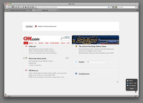
Now, Aza and company have been doing fun work with what this would look like in Firefox. It is a lot more subtle, especially the latest visual update. I love the subtle things such as knowing that I often go to my clipboard to having an action right there.
I also have really enjoyed how this has all been done as a plugin itself, and the process has happened very much in the open. Imagine if you could talk to the Apple engineers and help them do the best job they could for Safari? You can’t. With us, you can.
Also, this being Firefox, you can tweak the hell out of this puppy by greasemonkeying the page, setting the page to your own beast, or writing your own plugin to do something really fancy (like being able to tie into the same places database to do cool things).
You may think that you will hate these new pages, but as long as they load up just as fast as an empty page (perceived to be) you may find that, like me, you don’t actually care at all.

April 14th, 2009 at 8:54 am
I’ve also been in the same mind-set where I hate having the home page or new tab page take forever to load and ended up using about:blank. Recently I installed the new tab page Aza has been working on and am loving it. I set it as my home page as well (which was a workaround… view page info > copied the address… could be easier?). I’m looking forward to seeing it continue to progress.
April 14th, 2009 at 8:56 am
Don’t like Aza’s mockup at all. What I like about Safari (and Chrome) is that you don’t really have to read or parse or think at all, because it’s a screenshot. “That’s where I want to go!” Your hand just moves the mouse and clicks. It’s automatic. It’s reflexive.
Aza’s mockup looks like it should be my.mozilla.com or something.
I think Chrome and Safari have this right and this FF mockup has it wrong.
I use this in Safari and Chrome all the time, because I find that 90% of the time where I want to go is already there. When it’s not, I just start typing in the address bar and a couple letter is usually all I need to see where I want to go.
I used to be 100% Firefox, but I find myself in Safari 4 on Mac and Chrome on PC now. Seems like Firefox needs a rev to catch up or something. Feels stale. Still like the awesome bar in FF better than Chrome’s version, though. Try typing “google finance” in the address bar and hitting Enter. In Chrome: yuck. In Safari: Double yuck! In FF: Yes!
April 15th, 2009 at 12:31 am
I’ve also went through this, though not with Safari but with Chrome. On my Linux machine I’m stuck with Firefox (sorry, but though it’s the best choice for GTK, it’s still really slow on js and chokes with > 20 tabs opened). And for years, about:blank was my option for a new tab.
On the Windows machine I use Chrome, and it took me about two days to stop worrying and start loving their “New Tab Page”. Safari’s version looks a bit too overwhelmed for a “new tab”, so as one of the extensions I tried out for Firefox. Aza’s page looks clean and simple, but I have to agree with Nosredna here: it shouldn’t do anything but showing a cached screenshot/description.
August 29th, 2009 at 9:23 am
Thanks for the info, everyone!
November 19th, 2009 at 10:17 am
Interesting, i have always been a add igoogle there thank you, but thinking about it the about:blank method seems appealing, but the low and behold in the space of 1 article i have changed my mind again already! Very much gonna take a closer look at this Thanks