Mar 01
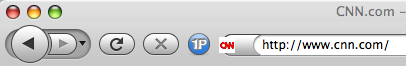
In general I think the new Firefox 3 Mac interface “Proto” is nicer. I keep seeing new versions come along, but they are all wonky for me, and I think it is due to my 1Password icon. The favicon.ico is always in the wrong place (as above).
I do think that that the buttons and elements are too big and roundy. I prefer the simpler Safari layout, and it doesn’t use as much room before the URL bar itself. It seems that people like to go crazy over these interface changes “waaaaah I liked it how it was!” but I am glad that they are playing with things…. and with Aza, I hope we see more ;)

March 2nd, 2008 at 3:55 pm
The small buttons seem to work better — you don’t have the giant honking “back” button taking over the universe.
March 2nd, 2008 at 5:51 pm
if you’re using the “Proto” theme, you should switch back to the default theme where the proto work is now happening. Also, if you prefer smaller buttons, you can get those in the customize toolbar dialog.
- A
March 3rd, 2008 at 7:19 pm
That default blue 1Password icon doesn’t really fit in very well with Proto does it? :) We will make sure the default matches when FF3 is released, but in the meantime you can customize the button if you want to; I think the Safari one would look nice. Sadly you have to hack the application resources to get this to work at the present time.
Regarding “wonky”, it could be because of the 1Password style sheet. Does the problem continue if you temporarily disable the 1Password extension?
March 5th, 2008 at 10:17 pm
Nah, I get the weird favicon thing too, hence Googling for info about the theme. It’s only on this computer though — work laptop works perfectly.