I have been having a great time hacking on code that let’s me do interesting things on my device. With webOS you get to use your old favorites (HTML/JS/CSS and Web APIs that you know) and now you are ready to take Web applications that you may have even already written, and make them work for the mobile form factor.
The two biggest challenges I have found so far on the design side have been dealing with the real estate available (screen size) and the touchy feely-ness of the device.
We have been trained on the desktop, thanks to the mouse as our pointer interface, to click lots of buttons. The tactile feedback that we get is the button looking depressed, but that is about it. The mouse has a lot going for it. The fact that I have a set of states due to the fact that there is a difference between having the cursor located somewhere, and having a click on that location is useful. It can be especially useful for discoverability. As a user mouses around you can unveil information “hey, if you click this button X will happen mate!” It also has the nice side effect that your hand can rest on it.
The infamous Minority Report interface looked great, and spawned many “look how we can do this now” prototypes, but try holding your hands in front of you for 10 minutes, let alone 8 hours :)
The mouse has a lot of drawbacks though. It is a level of abstraction. You aren’t touching the objects, you are touching a device that takes your input and does the real touching. This of course leads to touch screens and bypassing that abstraction. Watching my son tap and drag and manipulate a touch screen has been great to see. It matches the physical world a lot more. He tried to touch my laptop screen at first too.
Since you are mimicking the real world more though, you get into the uncanny valley problem. If you drag something…. it SHOULD drag! One of the interesting design choices that iPhone made was to allow you to drag things even though some folks would say “don’t let them do that, there is nothing back there”. You then saw studies where people were taking their browser screens and dragging them around just for fun. Crazy :)
Applications started to take advantage of this. iPhone started with many buttons. The back button is the classic one that is all over the shop. On webOS there is a gesture area that trains you quickly to swipe back whenever you want, like going back a page. It is fun to watch a webOS user try to swipe when using an iPhone. You get used to it, you like it, it feels more natural.

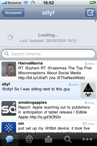
Applications like Tweetie 2 groked this too. They took away the refresh button and added a draggable notion. You drag the list down and let go to spin it into action. In many ways this is more work than a simple tap and is a touch less discoverable, but it has the benefit of “feeling nice” and once you know about it, there isn’t a darn button in front of you all the time. The UI can get out of the way.

The Newsroom feedreader app on webOS does a really nice job here too. You flip and drag and move throughout most of the interface. After awhile it feels like you have a large virtual space and you are just moving the view port around to see what you want to see. It feels nice. I strangely find that it makes me want to use the application much more than an app with buttons and simple taps. Maybe I am just strange.
I find that I really enjoy the horizontal scroll. I wanted to build a simple HorizontalScroller component for webOS, but first I will detail the low level side of using a Scroller webOS component to get this effect.
The code for all of this is in my HorizontalScroller GitHub repo.
A simple way to build a horizontal scroller is to have a div that contains all of the pieces of content (pre-loaded, or you can lazily load by adding nodes to this div). It extends wider than the 320px viewport size of the Pre/Pixi and contains other elements that are each 320px. We have a view that contains this, and a controller that sets it all up:
The View
Here is how we setup the component with 3 items:
<div x-mojo-element="Scroller" id="scrollerId">
    <div class="scrollerContainer">
        <div class="scrollerItem" id="scrollerItem:1">first</div>
        <div class="scrollerItem" id="scrollerItem:2">second</div>
        <div class="scrollerItem" id="scrollerItem:3">third</div>
    </div>
</div>
</div>
and we style them:
/* A scroller needs a container element */
.scrollerContainer {
    width:  960px;
    height: 400px;
    border: yellow solid 1px;
}

/* An item that is viewable in the scroll pane window */
.scrollerItem {
    float:     left;
    width:     320px;
    min-width: 320px;
}
The Controller
The code that turns the divs into life lives in the controller.
this.controller.setupWidget("scrollerId", {
                   mode: 'horizontal-snap'
               }, this.model = {
                   snapElements: { x: $$('.scrollerItem') },
                   snapIndex: 0
               }
        );
The key is the “horizontal-snap” mode that make the drag physics feel right and ties to the snapElements which are the DOM elements for the inner divs. The widget takes care of snapping to those elements for you!
Of course, you can use this base to do a lot. The afore mentioned Newsroom styles the divs so it looks like switching cards.
Next up: I will get the HorizontalScroller component done and dusted to make life even easier.
Conclusion
It is enjoyable to use the constraints of screen size and the natural feeling of touch and put them together to make great apps that live with you in your pocket. I thought screen size would be a huge issue, but in some ways it has been nice to have that constraint. It means you focus on the core functionality. Dealing with the touch vs. mouse issue is an interesting one too and will have you ending up with a very different interface if you embrace the feel.
What have you found enjoyable about using mobile apps vs. desktop ones?

February 6th, 2010 at 10:28 pm
Have you found any designing-for-mobile techniques, maybe in existing apps on other platforms, to support the hover functionality that you mention missing? I really miss it, too.
I’m in Singapore and can’t get my hands on a Pre yet (at least, not 16GB which is my min acceptable), and the emulator doesn’t allow for much experimentation with gestures.
I wonder if this would work:
1) Tap and hold: Should behave the same as desktop hover, but hover msg appears in notifications area
2) Release tap with rightward flick: Should behave the same as desktop click
3) Release tap without flick: Should behave the same as moving from hover on desktop
What do you think?
February 10th, 2010 at 6:50 am
Great tip. What would be even better if you added left and right arrows indicating more content (see “Scene Basics” – “Scroll Fades (with a button in a footer)” in the “Style Matters” project).