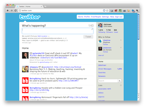
Yesterday’s announcement of what was immediately dubbed #newtwitter has crept up on me in its significance.
While Twitter has been growing in mainstream significance and popularity, it hasn’t managed to adopt a strategy that clearly aims the company towards mass market success. I think #newtwitter changes that, turning the site into a rich information discovery platform, if you’ll excuse the buzzword bingo. The new design is a pleasure to use, and encourages a kind of deep exploration of the data within Twitter that has previously only been exposed in bits and pieces by third-party applications. Browsing Twitter is now as rewarding as communicating with it.
This comes from Alex Payne, former Twitter API architect and all around top notch bloke. The new Twitter interface came at an interesting time for me. You see, Ben and I are working on upcoming presentations for Web Directions, JSConf.EU, NY JS, and Web 2.0 Expo. We have been spending some time analyzing the interesting worlds of apps vs. mobile Web, and how the worlds are converging in interesting ways. After the Twitter for iPad came out:

it was a stark contrast with Twitter.com:

On the iPad, the team had done a great job thinking about the feel of the application and how people sit back with their tablet devices and interact with them via touch. The stacking system is fun to use, and although some times it feels a little rough, it feels that way in the way that things in the physical world can feel rough. I like it. Of all the features, the only feature that truly matters to me is the inline preview of URLs. As soon as I experienced it, I knew it would change how I use Twitter. Flipboard is great, but is a fun sit back experience that I actually tend not to use. Twitter for iPad however gives me a more practical experience that goes beyond 140 characters. The Web joins me in the application rather than shooting me out to other tabs in the browser, or apps in the silo space.
After using the iPad version I started to ponder how different it was both from twitter.com and desktop clients (Tweetie for Mac, echofon, etc). I am not a TweetDeck “let me view lots of lists!” type of user. My desktop client sits in the corner, an appendix. I like how echofon uses draws to extend the space, but I now want to be able to change the size of the window and when large enough, flip to a tablet view. There is no reason that the desktop application couldn’t morph nicely and let me use the same application for my different use cases (small area of the screen to view tweets going by, extended version to immerse in the experience). When looking at twitter.com, the boring list of Tweets seemed poor compared to FriendFeed and Facebook’s expansion of that area. Those sites did smart things based on the type of content in the status update, they show comments right there, etc. Twitter has been notoriously awful for tracking the conversations being had in @replies. Changing this dynamic will change the conversations.
Just as I was looking at the touch iPad experience side by side with twitter.com and wanted to shout “the Web can do that too!” Twitter came along and implemented a fantastic rewrite of the site. The new Twitter brings an experience into the site that makes it so much more usable than 140 characters with a link.
Steve Souders just posted about his movement from blogging to Twitter. Twitter has very much changed the way I view blogging too. On Ajaxian.com I wanted to bring the community together to discuss the Ajax revolution. One of my goals was “if a developer only has a few minutes to see ‘what is important today?’” they could come to Ajaxian and feel like they are keeping up. There were other goals too (e.g. run The Ajax Experience as an excuse to get the top Ajax talent together to further the Web). The site had some exclusive content, but it was very much an aggregator, a curator. In that vein, my twitter feed started to become just as good as the website for the goal of people keeping up to date. With the new Twitter interface, that is even more true. That isn’t to say there isn’t room for more however. We have had visions of doing much more on the social community side, and hopefully one day we will get a chance to implement those visions. Whatever the case though, Twitter will be a real part of the solution.

Our users are expecting fantastic experiences. Once expectations are changed, the previous world is unusable. The day you played with Google Maps was the day you couldn’t deal with MapQuest. It felt archaic in comparison, but a day before hand you were fine with it!
The apps revolution has pushed fantastic experiences on us. With webOS we are showing that the Web can be a fantastic native runtime for these experiences. Today, we got to see Microsoft get behind the Web in a huge way.
“With HTML5, you can make as rich an experience as an app.”
At one point, Microsoft came along and pushed the Web forward with IE4, 5 and even poor old 6. However, once they had the market-share they gutted the team and moved on to WPF and Silverlight. The Web was the ghetto but to do beautiful, rich experiences…. use Silverlight and WPF! This is why it is amazing to see them pimp the beauty of the Web. You kinda have to rub your eyes in this turn around! Next, I hope that the Windows Phone 7 folks get the memo ;)
Now all of the top browsers have fantastic runtimes that are competing heavily. Fantastic news for us all. The Web is going to change in a huge way, and as developers we need to step up to the opportunity to deliver these experiences across various form factors. Right on.

September 16th, 2010 at 10:07 am
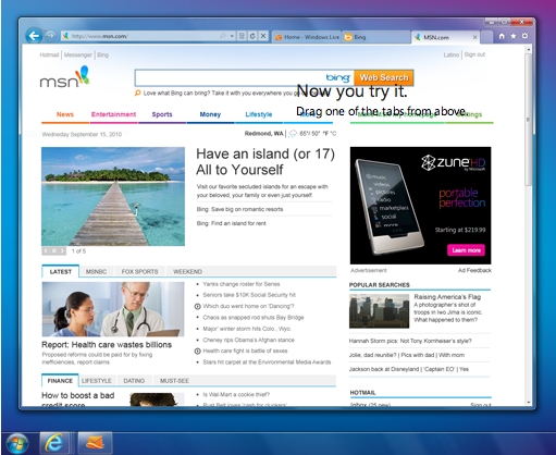
Ugh… IE 9 puts tabs in the same row as the address bar. Terrible idea! Very little space for your tabs. That alone makes it suck big time.
September 16th, 2010 at 11:50 am
The interesting thing is that Chrome OS had an option to do a “Compact Navbar” last year when CrOS was announced, but I don’t think it’s still there so I guess they thought it was a bad idea.
http://i.cbsi.com.au/story_media/339299832/chrome-os_14.jpg
I really don’t find chrome’s interface to be that remarkable. It’s a little odd that virtually every browser has adopted most of Chrome’s ideas, tabs on top, omnibox, JIT (which was sort of inevitable).