Frustrating User Experiences: iPhone Dashboard Manipulation
I primarily use the iPhone as a read-mostly device. I rarely reply to email unless it is very important, or I can send a one line reply. One of the user experience issues that has been bugging me recently on the iPhone, is the way you are made to interact with your home screen experience.
When you had one screen of apps, the “hold down on icon and drag around” experience was fine. Now though, you have 5+ screens, and if you want to migrate something from the last screen to the front, you have to drag and slip on the edges to try to move along. You then drop it somewhere and everything else gets pushed around. Ugh. It is exasperated by the fact that when I get new upgrades on apps that I have, they end up appearing at the end instead of the icon where they were.
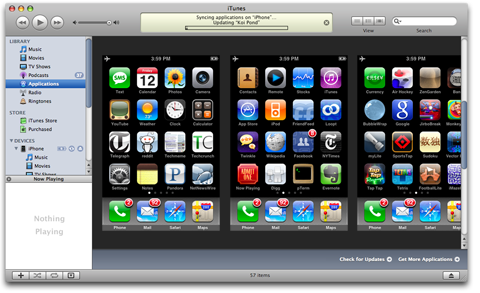
Why doesn’t iTunes give me a nicer interface? A simple way that can show a set of the screens, and use keyboard and mouse to easily work with the icons.
It’s a small thing I know, but it would mean less frustration when I get that new application :)


September 16th, 2008 at 9:16 am
That would be a great addition! I get annoyed whenever I add a new application and need to move it about, hopefully we will get something similar in the future!
September 16th, 2008 at 1:42 pm
Couldn’t agree more. This makes me mad every time I have to do it.